
HeyThrivy
Building a better experience for HeyThrivy customers

THRIVING
Building a better experience for HeyThrivy customers

INTRO
HeyThrivy is a unique Seattle startup offering personalized home management and home services through a subscription based model.
This is the story of designing a better web app experience for HeyThrivy customers, so that they can delegate the work of managing a home, running errands, or planning events to their friendly home manager and can spend more time on the important things in life.
MY ROLE
As the primary User and Usability Researcher, Content Strategist, and Data Analyst, I worked on this web app with two other UX Designers while at General Assembly (William Burroughs and Victoria Baik). I conducted secondary research, user surveys, user interviews, card sorting, data analysis, and usability testing.
Timeline: 2 week sprint

OPPORTUNITY
HeyThrivy approached our team with the challenge of updating their web app to increase customer satisfaction by improving the usability and adding some features to the original MVP app. We wanted to focus on the most obvious pain points expressed by the current users, and address any other low-effort high-impact improvements found during research. The web app is currently used to submit tasks to the user’s personal home manager, view task status, send an email to customer support, or view account details.

APPROACH
To empathize with HeyThrivy users, I began to immerse myself in literature on wealthy households and their behaviors surrounding the service and concierge industry. The target market for HeyThrivy is busy professionals or small business owners. I learned that this is very consistent with the market research on business concierge services which serve individuals or families that typically make over $100,000. Many of these individuals are well educated professionals like corporate executives, doctors, lawyers, money managers, or small business owners.
DISCOVERY
I learned that these individuals are very willing to pay for home and errand services so that they can spend more time with family or leisure. I also gathered some of the top-requested tasks through primary research with HeyThrivy data, as well as secondary market research. This led me to focus additional research on the types of tasks requested and the methods used to request assistance.
Insights from this research led to a list of main activities requested of a home manager or business concierge service:
Travel arrangements
Shopping or pick up services
Courier services
Event Planning
Arranging dining or entertainment
Fulfilling tasks associated with a business trip
Arranging home maintenance or cleaning services
Virtual tasks such as research

PROTO PERSONA
Research pointed to a small business owner persona that was used to drive design decisions.
USER RESEARCH
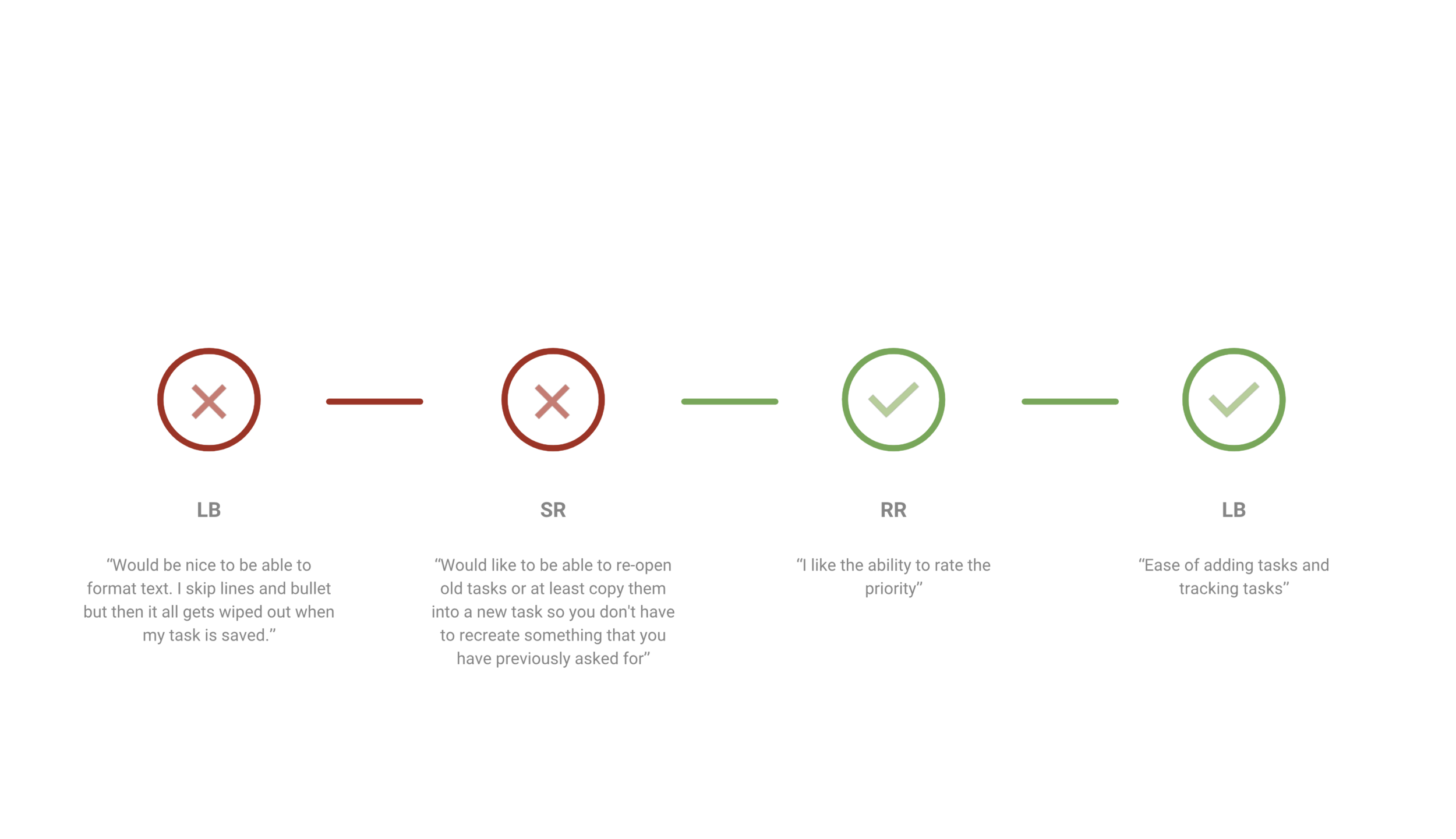
One part of the challenge presented to our team by HeyThrivy was to improve the app based on pain points expressed by the users. To determine these pain points along the user’s journey, I sent a survey to all current users and received responses back from 25%. The users were asked some basic demographic information, basic questions about what services they request, what is valuable to them about the service, what are ways that HeyThrivy can improve the app experience, and they were asked to rate their satisfaction with the app’s navigation, visual appeal, ease of submitting a task, and accessibility to view a task’s status. Half of the users that submitted survey responses were able to schedule a call with me for a more in depth interview.

HOME MANAGER INTERVIEWS
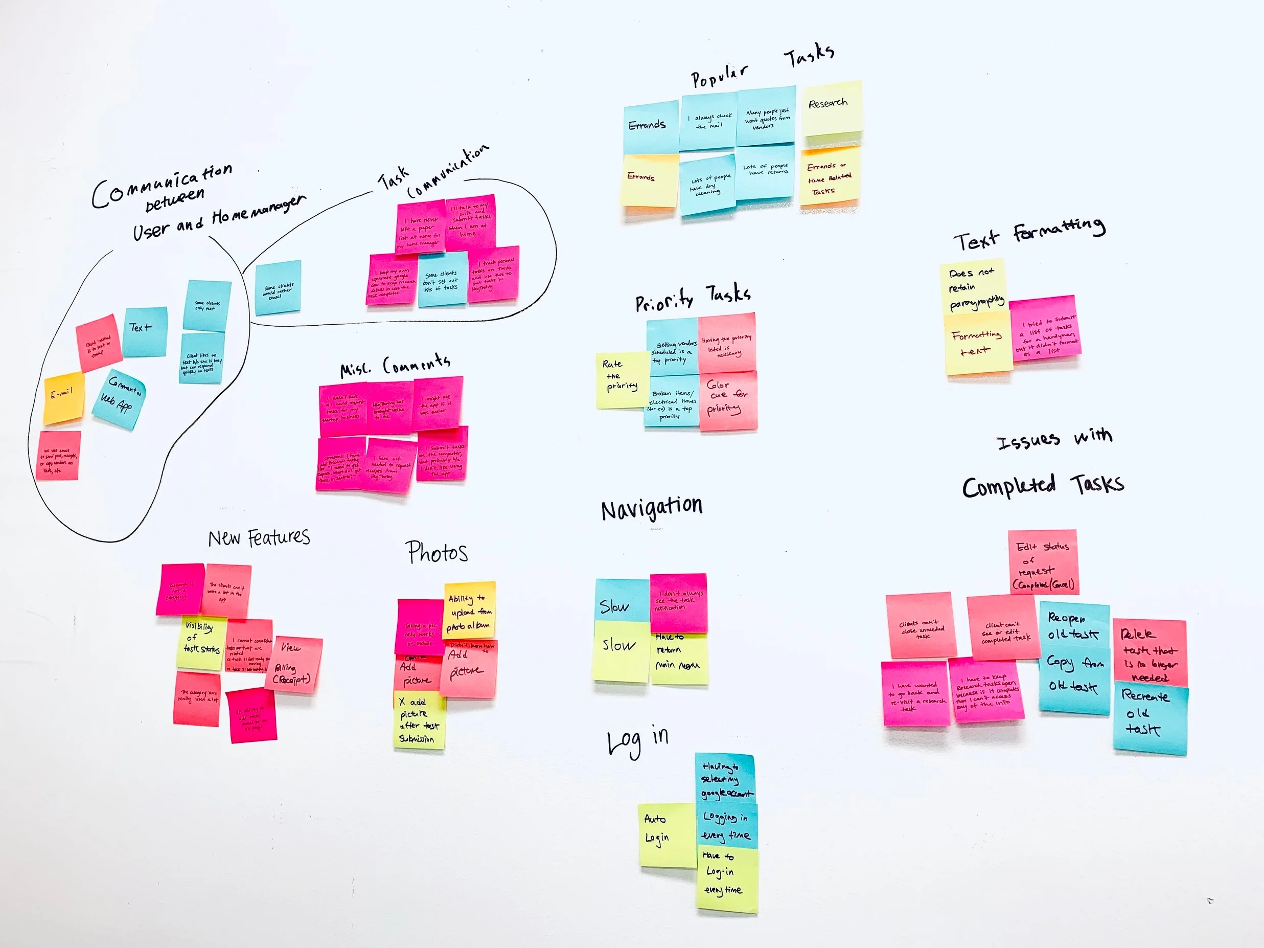
To gain additional insight into the user behavior with the web app and the HeyThrivy services in general, I conducted interviews with the secondary stakeholders - HeyThrivy Home Managers (employees). I wanted to learn how they organize their day, how they utilize the information submitted to them through the app, and what they have observed about how the users utilize the web app. I was able to sort the responses into two categories: feedback on the internal CRM system, and feedback on the users’ actions and behaviors. For the CRM system feedback, I developed a list of items for HeyThrivy to investigate with the support team. The remaining feedback on the user actions was integrated with user responses during synthesis.
SYNTHESIZING
I used an affinity mapping exercise to synthesize survey and both user and home manager interview responses into common themes, actions taken by users, and user attitudes towards the app.
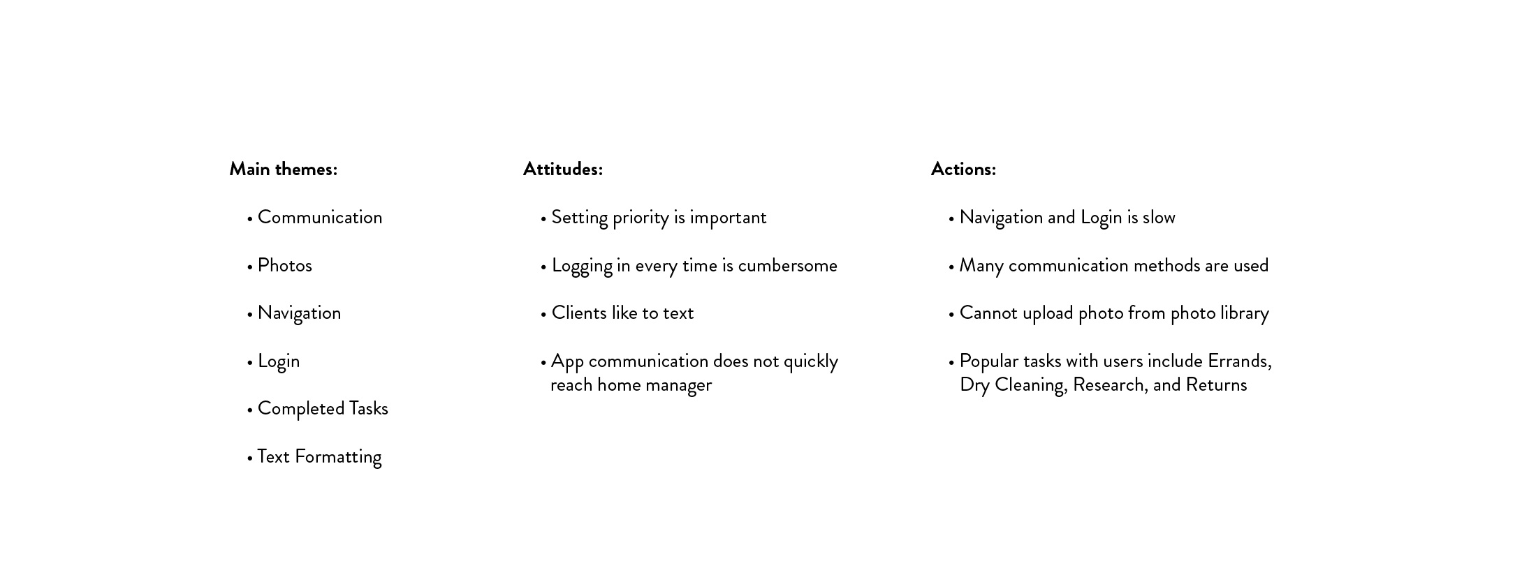
I conducted this activity so that I could narrow down some potential suggestions for the MVP
that would be sketched by my teammate working on the interaction design.
MVP
As I mentioned in the opportunity section, we wanted to focus on low-effort high-impact features that could increase customer satisfaction with the web app. The following navigation updates and new features were formulated from the research feedback:
Navigation
Home Screen for quick access to news and eventually quick tasks
Quickly create a new task
Quickly access a list of in progress and completed tasks
New Features
Interactive chat with home manager
Update task priority to Low and High
New categories
Save a task as a favorite
The goal of the navigation updates are to improve the average or poor survey ratings regarding navigation and ease of use, as well as address the user’s behavior of being very busy and having limited time to submit a task. The new features are suggested based off of the user and home manager interviews that suggest users don’t trust that the app communicates the task to the home manager in a timely manner. We are suggesting a chat feature that would help users to feel more secure with the app communication, and will also help reduce the amount of off-platform messaging such as email or text messages. Additionally, users need a way to create ‘favorite’ tasks so that they can submit these more quickly.

MVP COMMUNICATION
I utilized sketching to communicate these ideas to the interaction designer before he began working on a paper prototype.
CONTENT STRATEGY
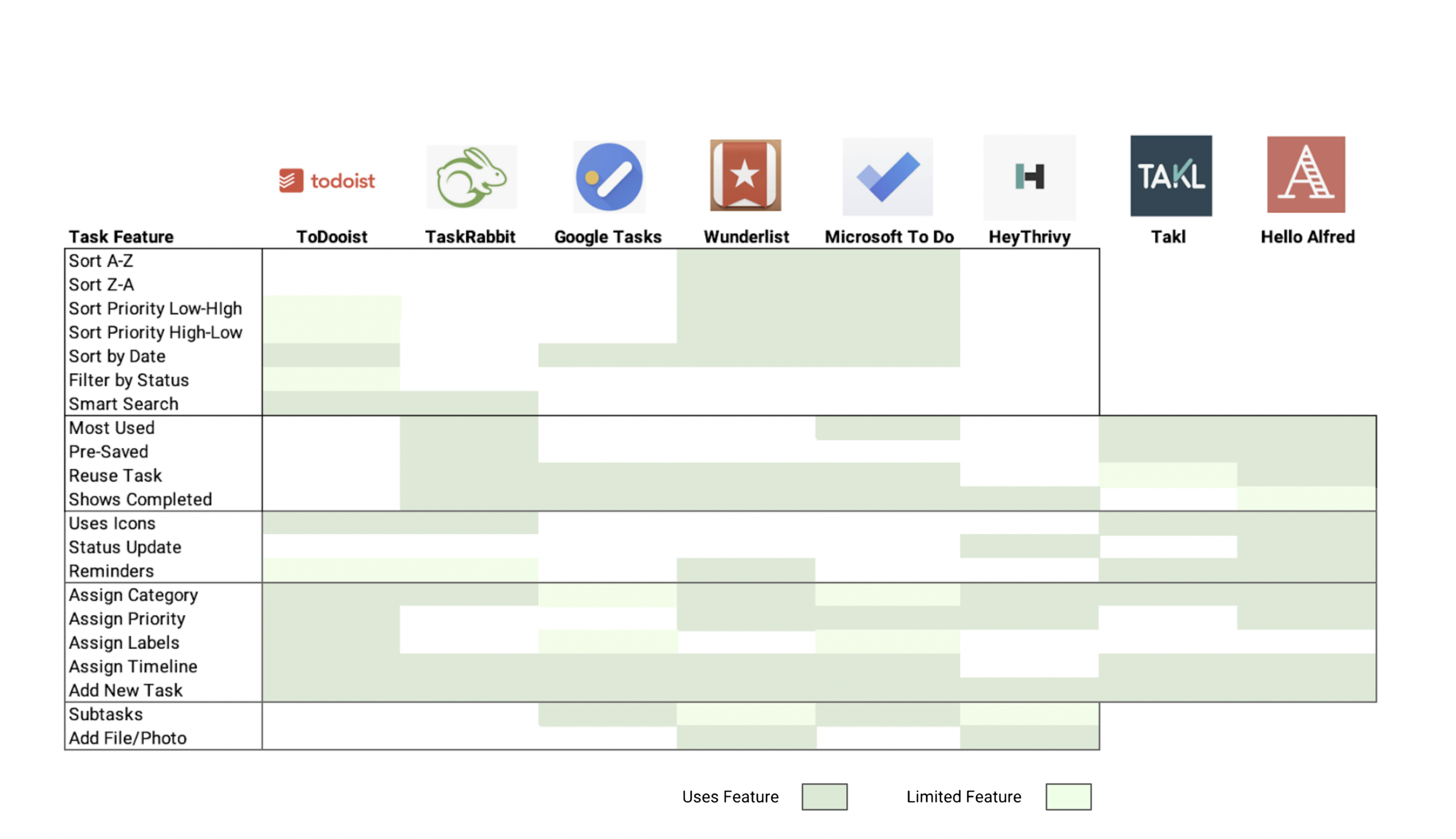
Once I knew that I would be dealing with feedback around submitting a task through the app, I looked to comparative mobile apps where one must submit a task. I not only looked at to-do list apps like Todoist, Microsoft To Do, Google Tasks, but I also looked at more competitive mobile apps like TaskRabbit, Takl, and Hello Alfred.
Note: Since Takl and HelloAlfred require a subscription to view many of the features, I was not able to view the task features in the first and last section. Those sections are excluded from the visual.
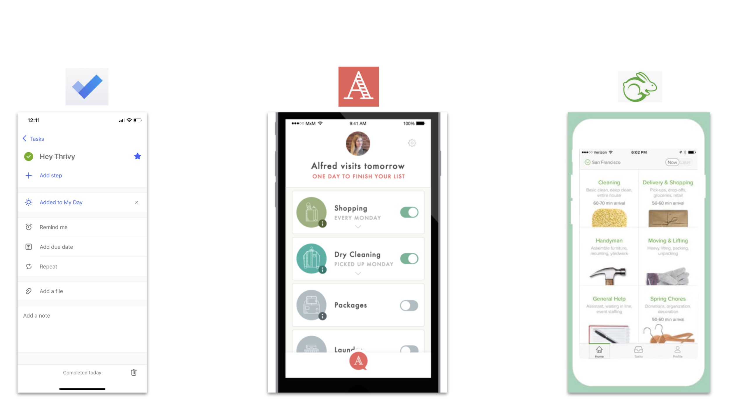
INSIGHTS
Sorting tasks is only available on a few of the apps compared, and I thought this would be more common.
Most apps allow a user to view and reuse a task which was a specific issue discovered in user research.
Competitor HeyAlfred and task services Takl and TaskRabbit utilize the options of displaying the most used tasks and allowing common tasks to be saved.
These insights directed our interaction designer to prioritize a button to quickly add a task, make the task list more interactive so that the user can view, edit, and reuse a current task, or save a task as their favorite.
DATA ANALYSIS
HeyThrivy provided me with a spreadsheet of all requested tasks during December and most of January. In order to provide sample content for usability testing, I took a few commonly requested tasks, as well as a few more unique requests so that the interaction designer could get this sample content into the prototype. Additionally, I analyzed this data export and noticed that many users categorized the same task title, such as “Donations” or “Pick up Dry Cleaning” into multiple categories. I decided to do two things with this data. First, I determined the top requested tasks and suggested that these be saved in the web app as a pre-saved favorite or a ‘quick task’ so that the user could just click the task to have it added to their list. This would allow the task type to be pre-categorized.
Top Tasks for Quick Start:
Return/Exchange
Dry Cleaning
Donation
Organize
Grocery
Secondly, I decided to do an open Card Sort to determine the most common groupings of task titles. I used Optimal Workshop to conduct a virtual card sort, and I used 30 tasks that were actually submitted through the web app. I then had 9 participants group the tasks into categories. This study was conducted to see if there is another way to set up Categories that may prevent users from placing the same type of tasks into varying categories.
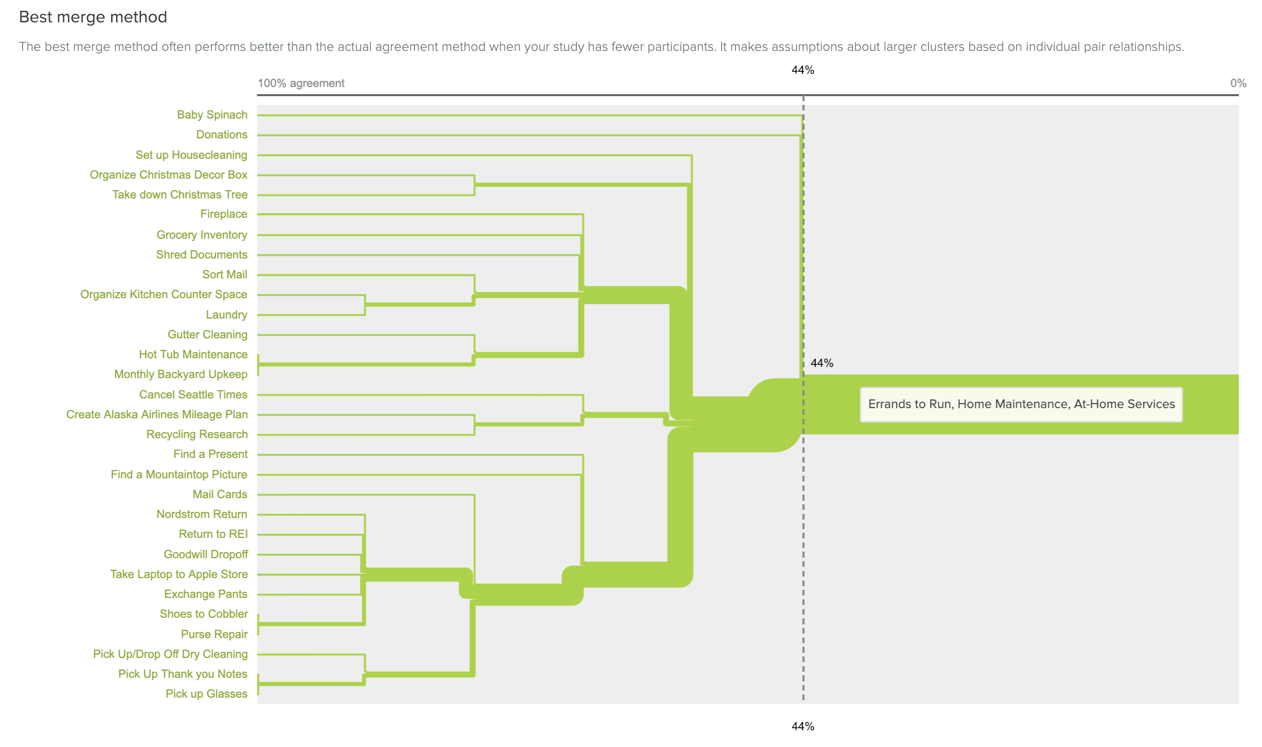
CARD SORT: BEST MERGE
This view illustrates that all of the task were sorted into three main categories: Errands, Home Maintenance, and At-Home Services.
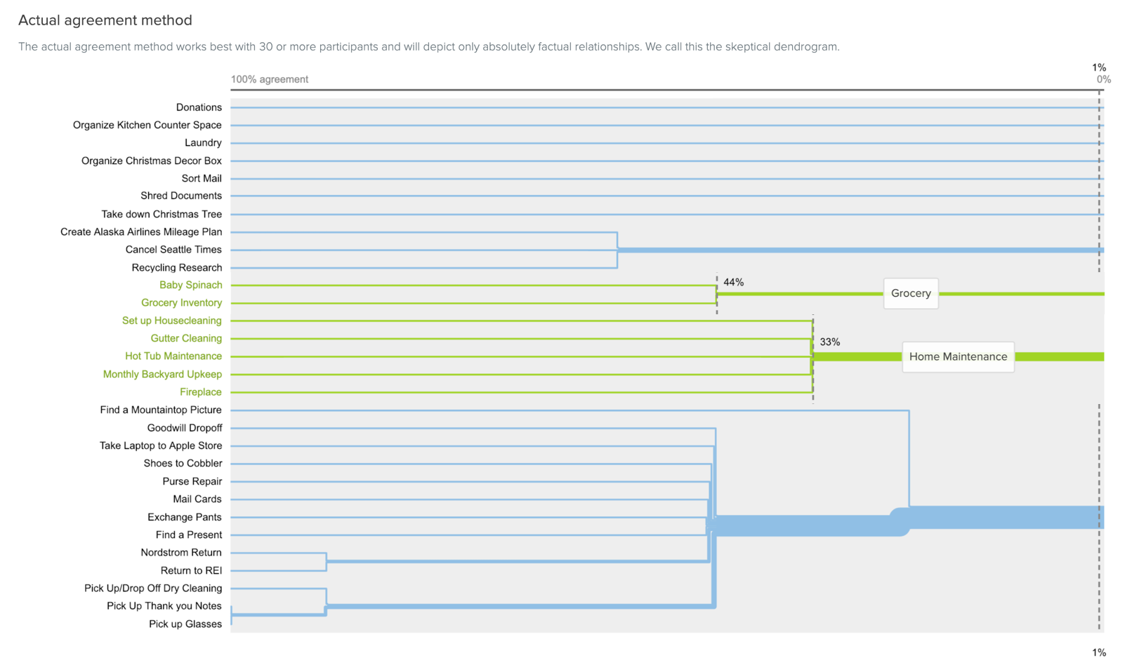
CARD SORT: ACTUAL AGREEMENT
This view narrows in on two categories showing the specific tasks that were sorted into categories together: Grocery and Home Maintenance.

CONTENT
To develop the final list of suggested task categories, I also utilized User Interview feedback and secondary research in addition to the card sort data.
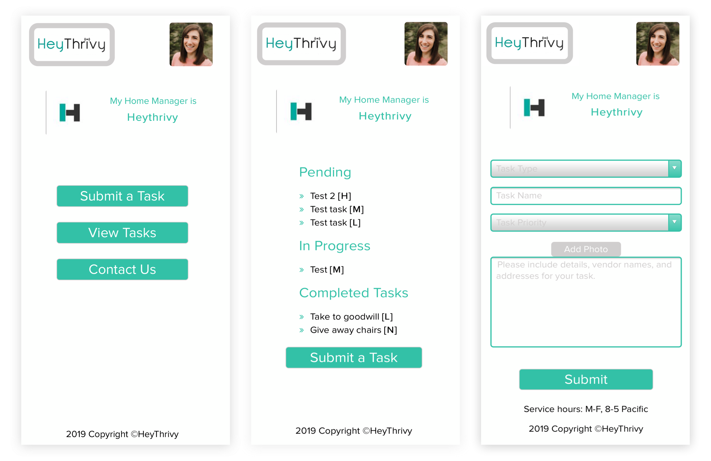
CURRENT APP DESIGN
There are 3 main pages for the web app: a Home Screen with three action buttons, a View Tasks screen showing tasks submitted, and the Submit Task screen.
Our interaction designer Will Burroughs put together the prototype that I tested with users.
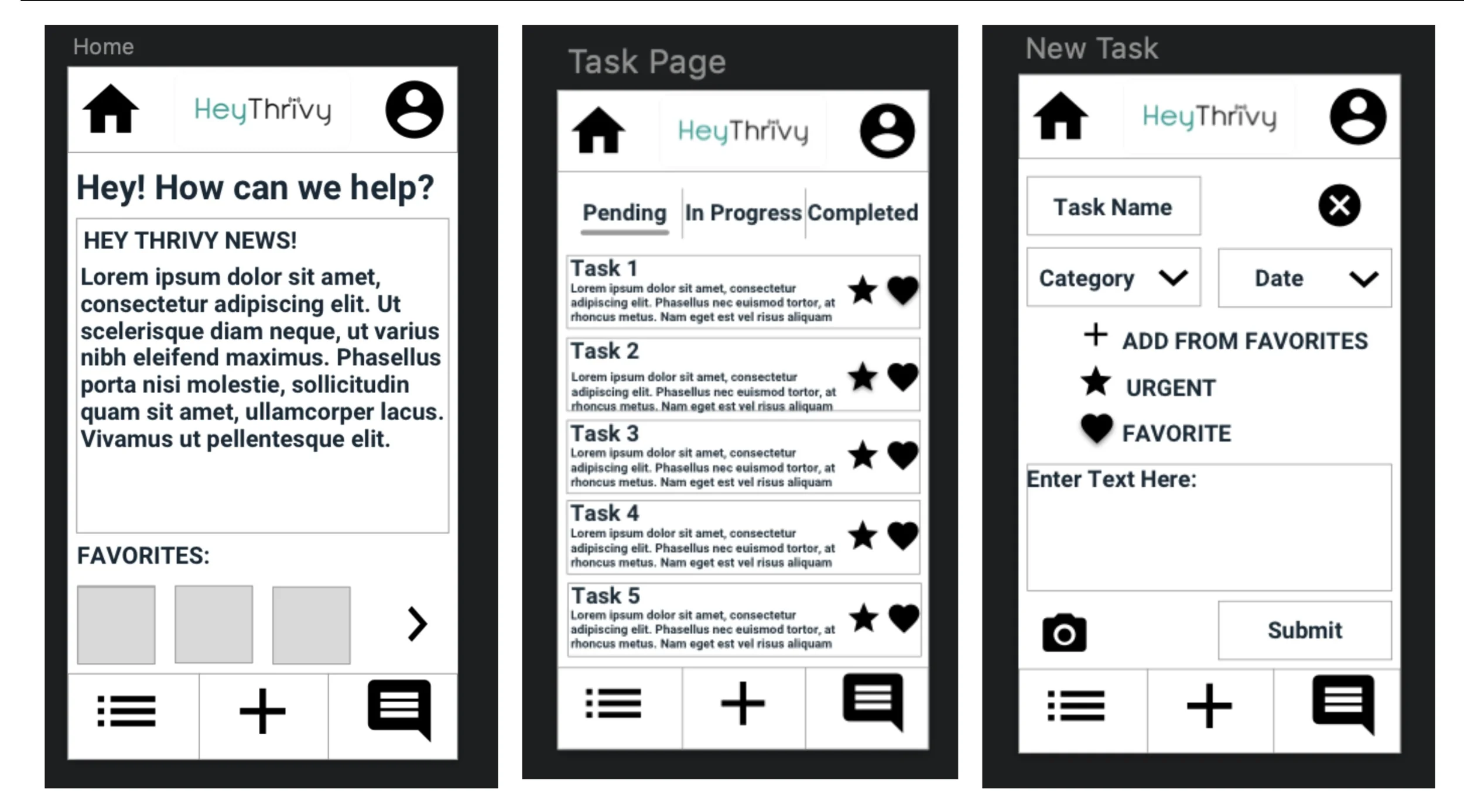
VERSION 1 PROTOTYPE
Received decent usability scores, but managing favorite tasks was confusing.
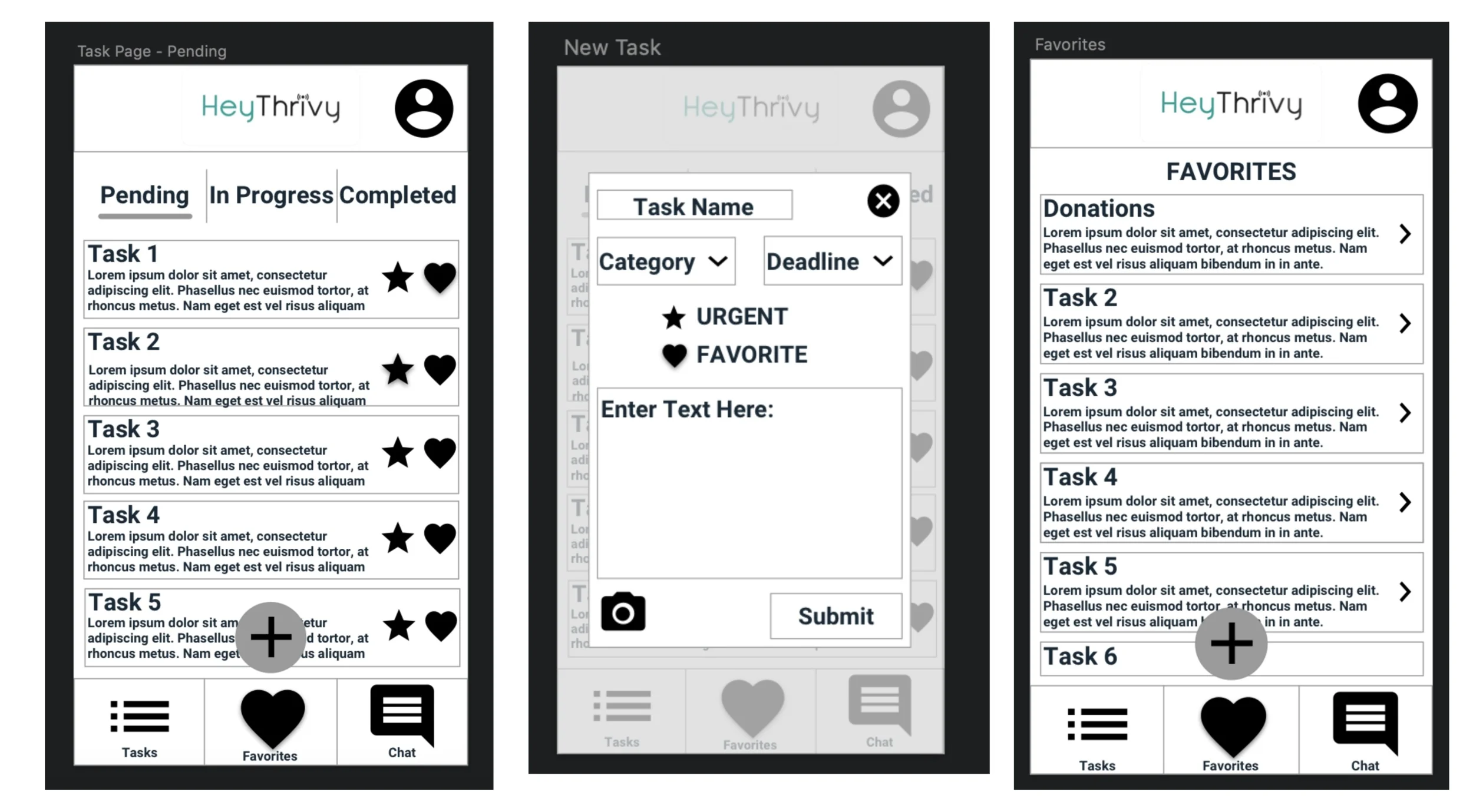
VERSION 2 PROTOTYPE
Removed home screen, and the app will open to the Task list. Includes a favorites tab, chat feature, and a floating action button to add a new task.
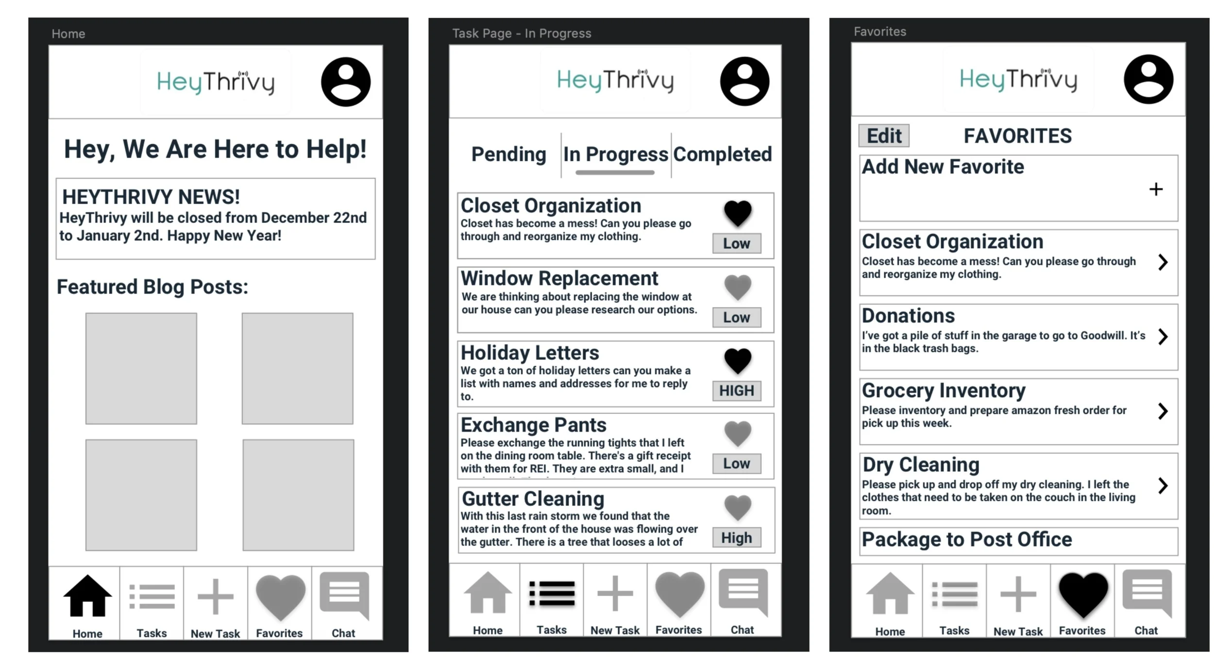
VERSION 3 PROTOTYPE
Removed floating action button, returned to a separate home page to allow proactive communication between HeyThrivy and users.
USABILITY
Users were recruited by the following screening requirements:
Must fit age category of current users: 21-60 years old
Must fit part of the persona profile of busy professional, business owner, or property manager
Must express that they would receive benefit from a service like HeyThrivy
TEST TASKS
Task 1:
You’re preparing for a visit from your meticulous in-laws and discover that your refrigerator is in complete disarray. Don’t stress - your HeyThrivy home booster appointment is this afternoon! Open the HeyThrivy app and create a new task for refrigerator organization.
Task 2:
Additionally, you want to submit a request to take some old items you’ve piled up to Goodwill. This task has already been created and is saved in your favorites. Find the donations task in your favorites and submit a new version.
Task 3:
Lastly, you just realized that you’re out of milk and won’t have time to run to the store today. Your home manager is supposed to arrive in an hour for your weekly home booster. Use the messenger feature of the app to get a quick message to your home manager letting them know you need milk.
After testing, users completed a Standard Usability Questionnaire to develop a Standard Usability Score (SUS).

SUS SCORES
*We focused on iterating version 2:
“This plus button is on top of a task. That was a little confusing.”
“I go to favorites and there's my donation. There's no submit button. Or do I just save it?”
“The send message button is confusing.”
“I don’t know the difference between Pending and In Progress”
The application improved with iterations, and the final wireframes were given an SUS score of 95.
This version 3 Prototype then went to our Visual Designer to become a mockup for HeyThrivy.
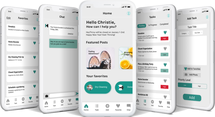
HEYTHRIVY WEB APP MOCKUP - Victoria Baik
IMPACT
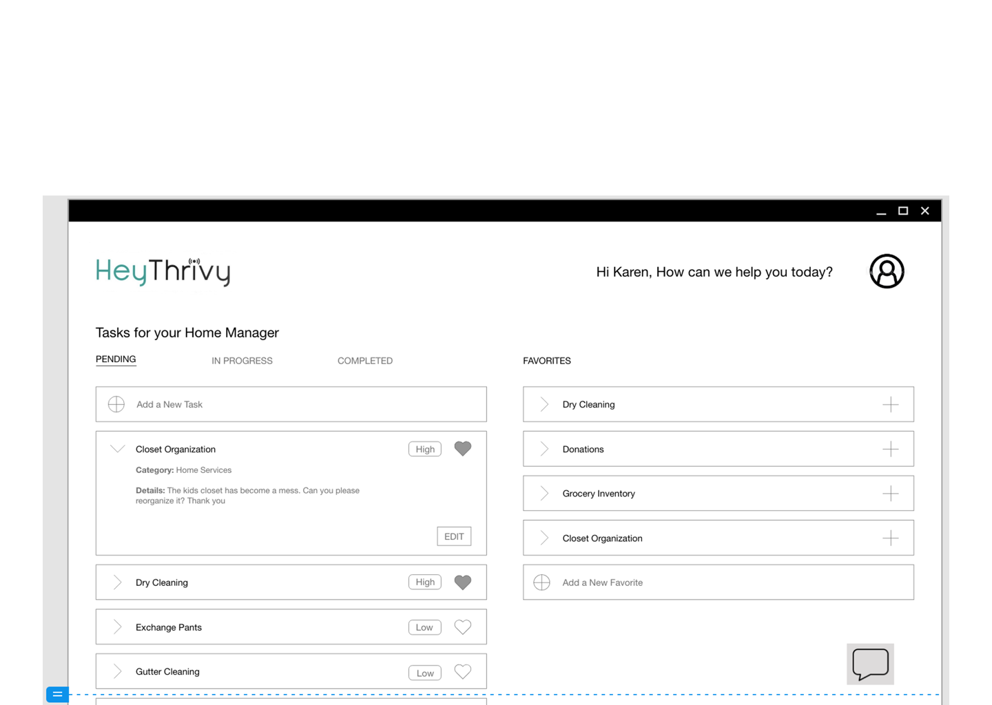
Since usability for the latest prototype version was given an SUS score of 95, I confirmed that we could advise HeyThrivy to move forward with the first app update. We suggested looking to an increase in tasks submitted over the application as a measure to see that the app redesign is moving in the right direction. Next steps would include further iterations on the mobile web app, as well as a new design for the web portal where users can complete the same tasks on a desktop. HeyThrivy worked with the outsourced development team to implement the mobile design. My teammate and I continued the project by wireframing, prototyping, testing, and delivering the suggested direction for a new desktop design.
“Thank you again for all the great work that you did on this project. I appreciate your insights and recommendations on the user experience and user design. I’d call this project a success!”