
Blue Nile - Checkout Optimization
Optimizing the checkout path has so far led to a 2% increase in conversion for users in the treatment group. We still have a lot of work to do and this project is ongoing.
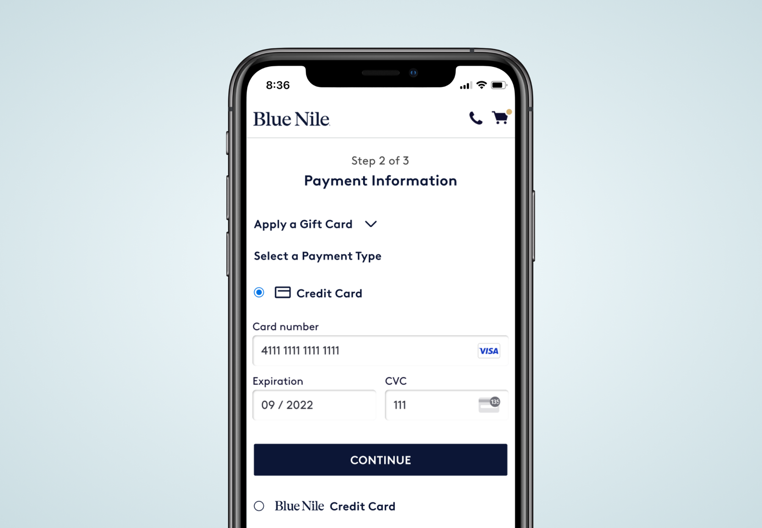
OPTIMIZING CHECKOUT
Blue Nile revolutionized the diamond and engagement ring industry with a disruptive online business model, and is the leader in custom handcrafted engagement rings and fine jewelry. This project seeks to align the checkout experience with best practices and the core values of the brand, bringing trust and clarity to the process.

MY ROLE
Discovery, Research, Design
Tools: Fullstory, Figma, Miro, Tableau

THE USER
While the bulk of Blue Nile’s users are purchasing engagement rings, a growing share of customers are purchasing self-gifted, bridal, gemstone, or milestone jewelry gifts. These are high dollar, emotional purchases and should be met with trust and convenience in the checkout experience.
GOAL
Optimize the checkout process to reduce effort for the user while gathering the same information, keeping accuracy high and errors low for the user.
We want to incorporate best practices and improve conversion. Keep accessibility at the forefront and ensure optimizations include international customers.
PROCESS
1. Discovery
2. Best practices research
3. Ideate on preferred state
4. Determine a series of MVP features, develop, and A/B test
5. Iterate
DISCOVERY
It had been many years since updates were made to the checkout flow, so I began Discovery by doing a current state exploration and documentation.
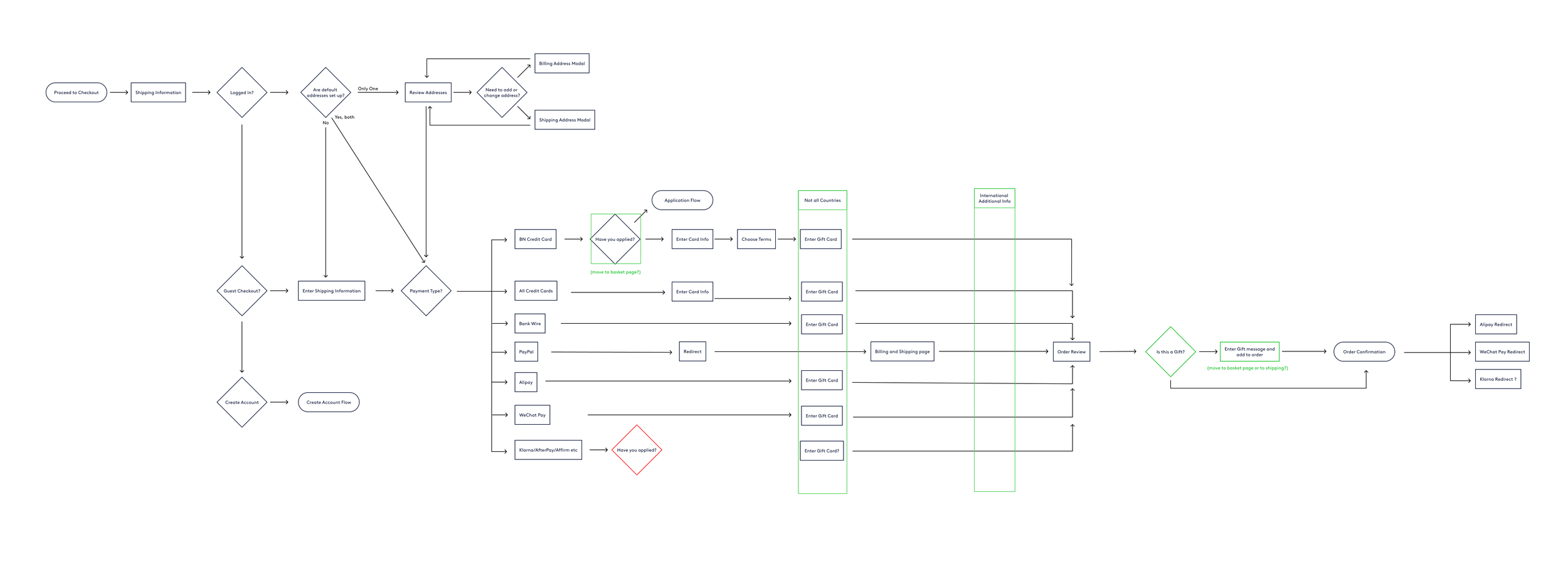
To understand the current state, I started by creating a user flow and doing an inventory of components. At this time I also tried to identify obvious opportunities to simplify the flow. For example, I noticed that we had gift messaging on the review page, which felt removed from the area where the user would input the recipients shipping information. There was also an optional customer survey on the review page that prompted the user to enter information just before purchasing. I advised that asking for this information post-purchase could improve the number and quality of surveys received, as well as remove distraction for the user.
2. I also watched numerous checkout sessions using Fullstory to better understand how our users were navigating and interacting within the checkout path. One problem area I began to notice was our Gift Certificate input. I narrowed in on one session where the user was so confused that they called our Customer Service to place the order via phone.
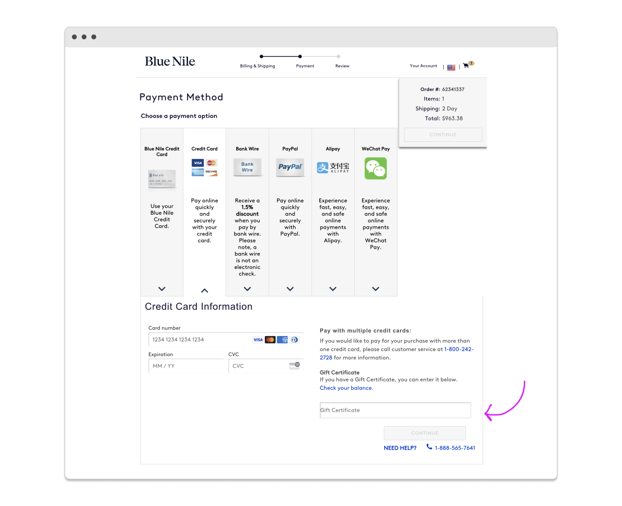
While watching the user attempt to use their gift certificate, I noticed that they kept clicking on to the different payment methods since they were not confident that their gift card was being applied. We needed to create a way to give the user feedback that the gift card amount was being applied to the purchase total.
3. To better understand the utilization of the design system and where the checkout path stood as far as consistency, I conducted a visual audit of the obvious form fields, modals, and interactions within the flow. Every page had differences, as no real design system was utilized. There was immense opportunity to get these elements consistent and build trust for the user.
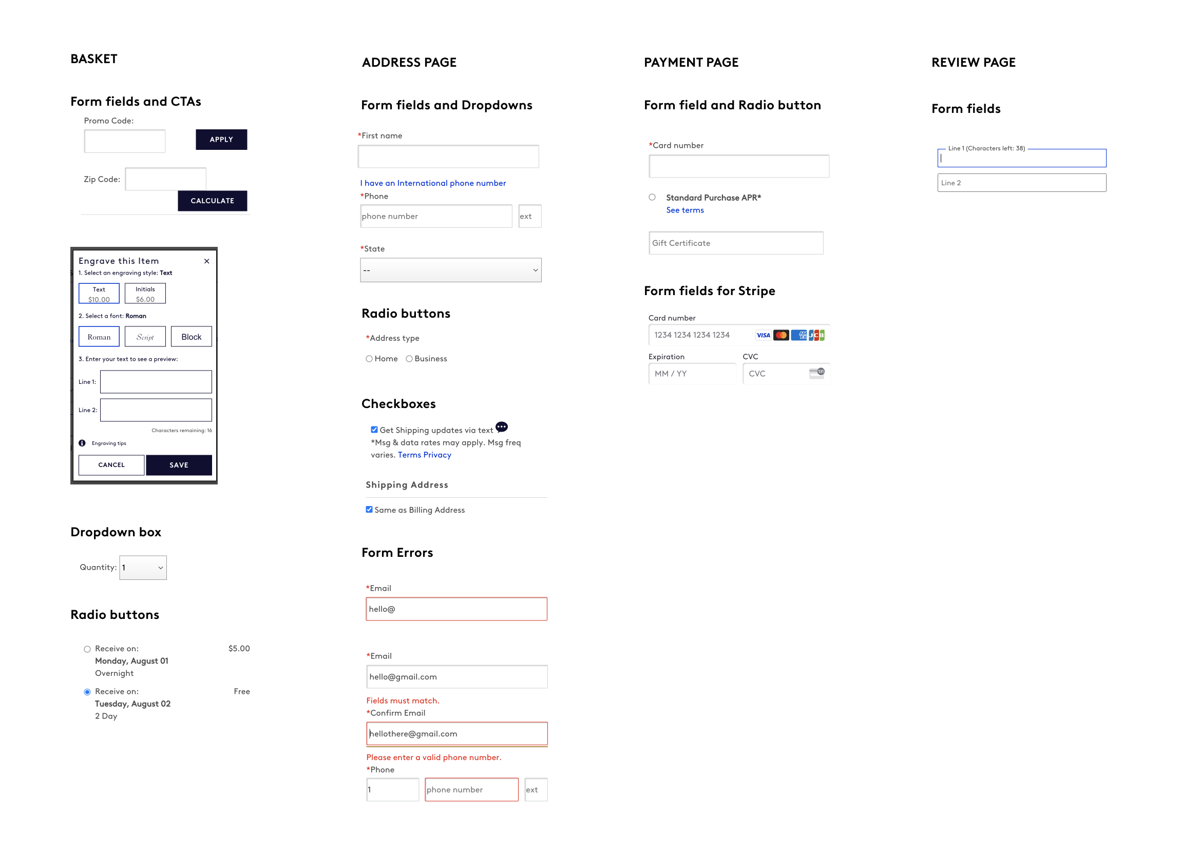
4. After this initial discovery, I went on to conduct more in-depth research so that I could be better informed when beginning to ideate on possible versions of an improved checkout. Several notes from discovery that I wanted to carry through in design were:
Make form fields and related elements consistent
Improve gift card/certificate functionality
Improve gift messaging location
Eliminate or relocate unused or unimportant fields
RESEARCH
Best Practices
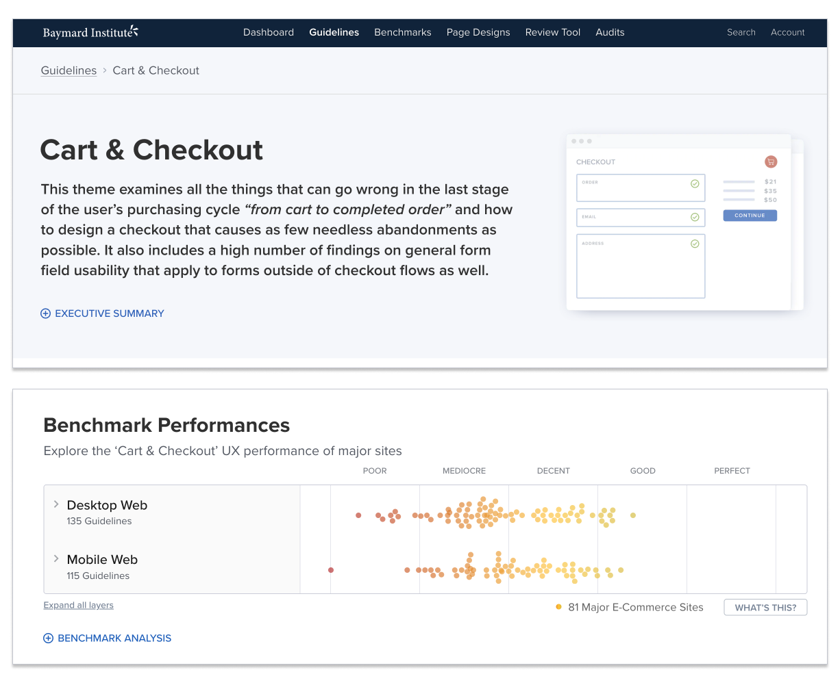
I started my Research by poring over best practices and the multitude of quantitative checkout research available through the Baymard Institute. This database was invaluable for user research that I was not able to conduct on my own due to time and resource constraints.
While going through the more detailed reports, I started with Baymard’s overview of checkout UX and developed a list of key findings that we could incorporate into the optimizations:
Present “Store Pickup” Within the Shipping Selector Interface (63% of retailers Don’t). Blue Nile currently only has this functionality for internal users.
Make It Easy to Compare “Store Pickup” to Shipping Options (75% of retailers Don’t).
Allow Users to Edit Data Directly at the Review Step (80% of retailers Don’t). Blue Nile has this functionality but it is several extra steps. This could be simplified.
Provide Separate “Edit” Links for All Distinct Information Groups (49% of retailers Don’t)
Avoid Jargon in the Checkout Microcopy (45% of retailers Don’t)
Mark Both Required and Optional Fields Explicitly (85% of retailers Don’t)
Support the “Back” Button for Navigating To Any Previous Checkout View (57% of retailers Don’t)
Auto-Update and Highlight Changes Rather Than Using “Apply” Buttons (82% of retailers Don’t)
Choose the Right Interface Type for Optional Inputs (81% of retailers Don’t)
Use Localized Input Masks for Restricted Inputs (56% of retailers Don’t).
Competitive Analysis
Since I knew I would be addressing the order of elements and the gift card input, I also conducted a few competitive analyses using two direct competitors and several other e-commerce retailers that scored well on the Baymard Institute checkout benchmarks and had smooth checkout flows.
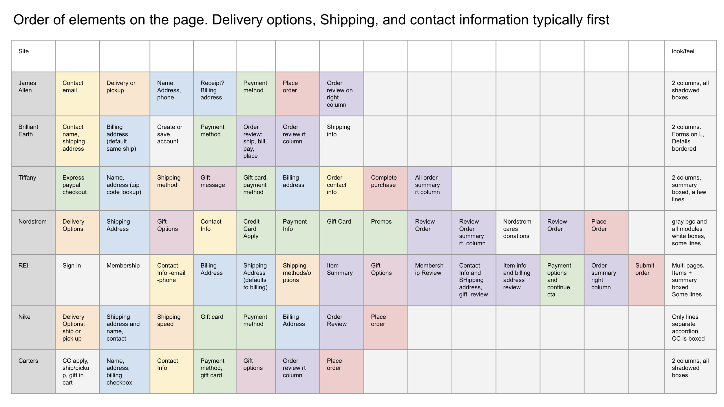
Order of Elements
Goal of Competitive Analysis: Develop an understanding how competitors order the steps of their checkout process and identify where Blue Nile may differ/could improve or streamline.
Key Findings: Competitors place delivery options, shipping, and contact information first. Blue Nile places billing information first, places gift options on a different page from recipient information, and captures contact information in different locations in the process.

Main Components
Goal of Competitive Analysis: Document functionality in shopping cart, address pages, payment options, gift options, review pages, and the general look and feel of the checkout path.
Key findings: All sites have an option to default copy shipping addresses to billing, almost all sites show payment method options in the radio button format, and almost all give the option to apply a gift certificate. The reviewed sites have either a two-column look and feel, or have the functionality of an accordion. Blue Nile did not have many of those capabilities
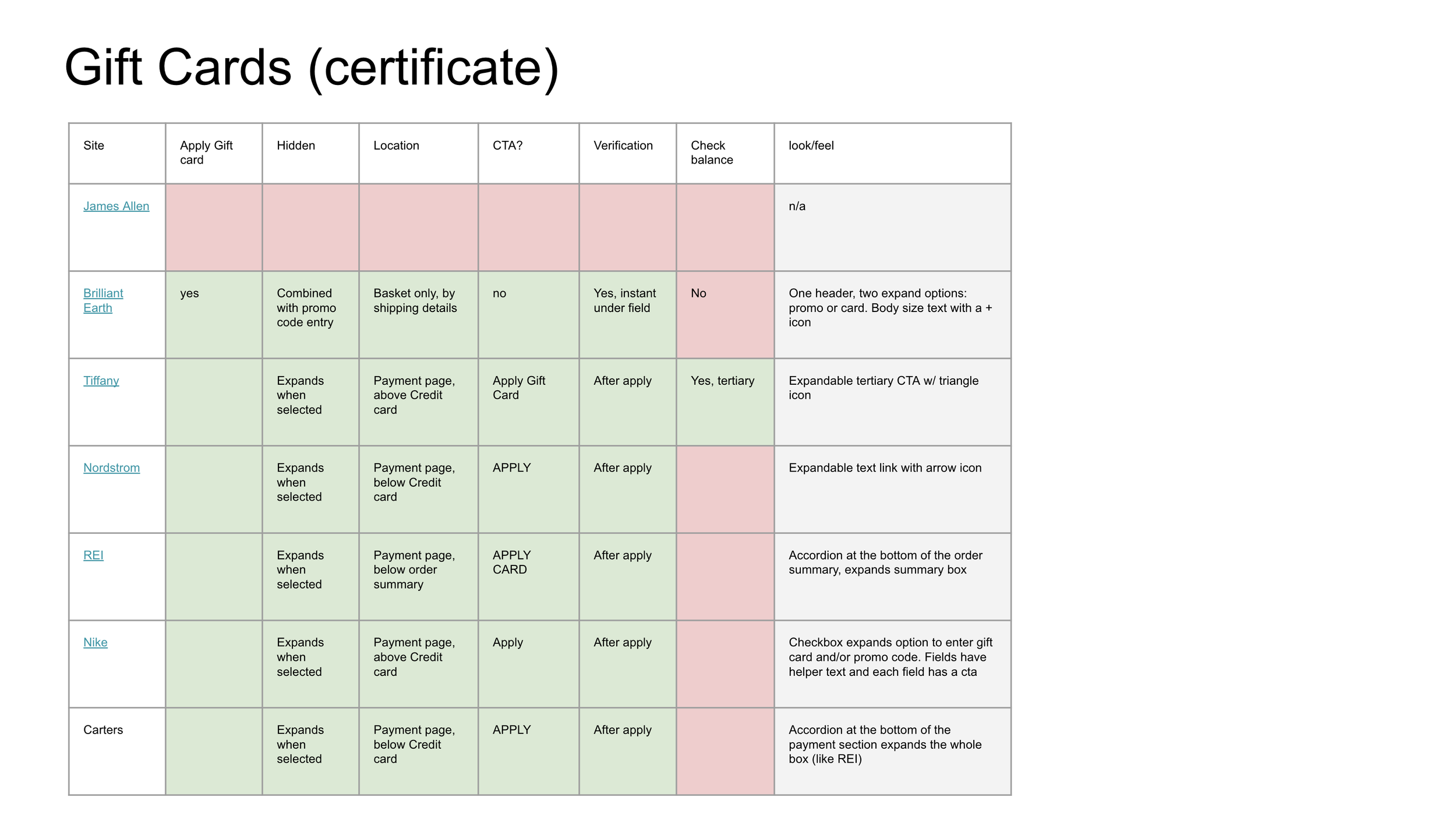
How do competitors allow users to apply gift cards
Goal of Competitive Analysis: Document the functionality of applying a gift card to a purchase as well as the look and feel of the feature.
Key Findings: Each retailer allowed the user to enter a gift card separate from the payment method. Most were hidden behind an accordion and most allowed the user to apply the card and see the updated price. Blue Nile requires the user to enter the gift card in the same space as their payment method and only uses one CTA to apply the gift card and the payment method simultaneously.
IDEATION
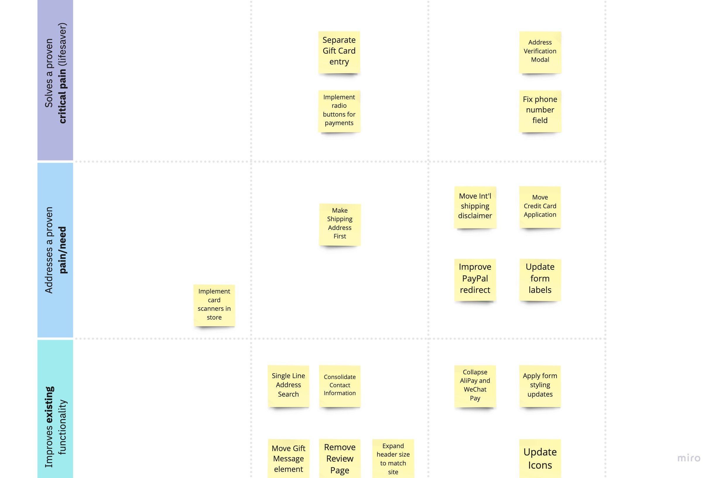
I began ideation by working with the product manager to create a feature prioritization canvas so that we could get started on some A/B Tests and learn from the findings. We identified some smaller updates that the team could quickly begin: improving the address verification modal, applying an input mask to the phone number field, and improving the PayPal redirect by using a PayPal branded CTA.
Meanwhile, I also began working on a prototype of the checkout flow that was more in line with a preferred state. This incorporated more of the best practice research and desired visual consistency updates so that we could have a vision of where we were headed and how to set up tests to get there.
MVP TESTS
Working with the Product Manager and the Checkout Engineering team, we developed a road map of enhancements and tests so that we could test our way into a better experience. We started with a small address verification modal and then worked our way through the various checkout pages with the goal of arriving at a user-validated two-page streamlined checkout.
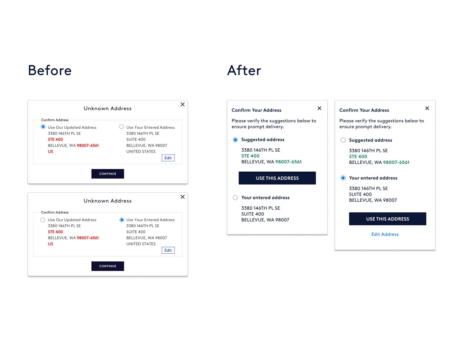
1. Address verification
The previous modal for address verification was difficult to understand and felt like a giant error message. To align with Baymard Research on address validation, I cleaned up the copy and font colors to better highlight suggested changes, and updated the CTA locations to more clearly associate with the choices available.
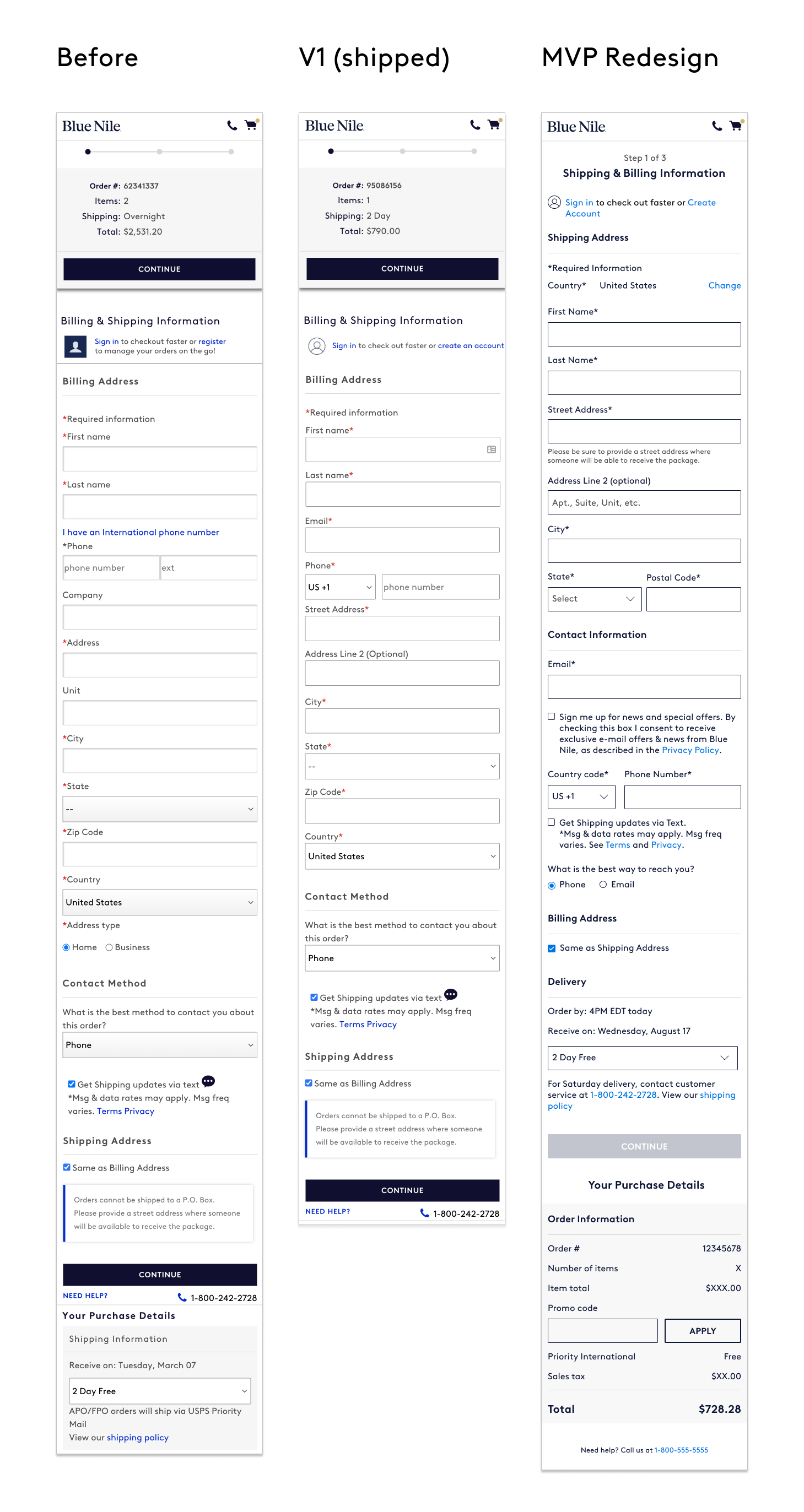
2. Improve the shipping address page
-Clean up the form fields, labels, and elements to make them consistent.
-Update to a simpler icon that is consistent across the account views.
-Remove unnecessary and unused elements such as the address type, duplicate email field, alternate phone number.
-Simplify the UI by utilizing one CTA, moving the large shipping disclaimer to be helper text, and using a more common format and input mask for the phone number field.
-Separate the contact information from the addresses, and put the shipping address information first.
-Move the delivery options above the CTA so that it appears as a choice for the customer rather than an easily missed field.
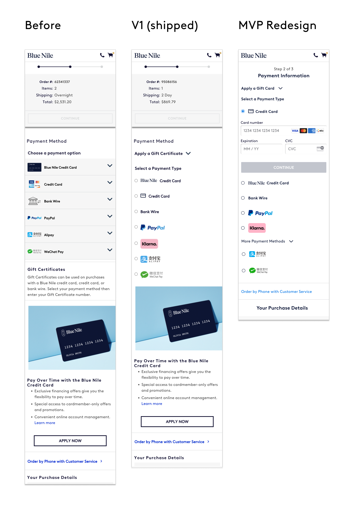
3. Optimize Payment Page
-Update payment icons.
-Update PayPal experience from clicking on the accordion to redirect to clicking on a branded CTA so that the customer knows what to expect.
-Change the format from vertical tabs on desktop and accordions on mobile to radio buttons.
-Make form fields and CTAs consistent.
-Improve the experience for users applying for a Blue Nile Credit Card by moving the link to apply within the specific drawer for that payment method.
-Improve the experience of in-store shoppers and Blue Nile jewelry consultants by integrating point of sale credit card readers.
At the culmination of these tests, conversion had improved by 2% in the treatment group.
MOBILE MVP REDESIGN WIREFRAMES
“At the culmination of these tests, conversion had improved by 2% in the treatment group.”
NEXT STEPS/ITERATIONS
The next steps in optimizing this checkout flow could include the following tests:
Update the address entry to a single line address search utilizing Google API so that the user can select their address and avoid any address verification. This will also result in less clicks and entry for the user, as well as cut down on any errors that might involve a customer service follow-up.
Move the gift messaging to the shipping page so that the user can enter all recipient information at the same time.
Research the order information section and improve on how we display the specific details of the purchase and the itemized cost section.
Remove the review page so that the checkout flow now becomes a two-page process and the user can easily view their purchase details as they are entering important information. Conduct more user tests at this stage while A/B Testing to get a better understanding if this layout is better and easier for users.