AutoNation Mobility - Implementing Favorites
AUTONATION MOBILITY
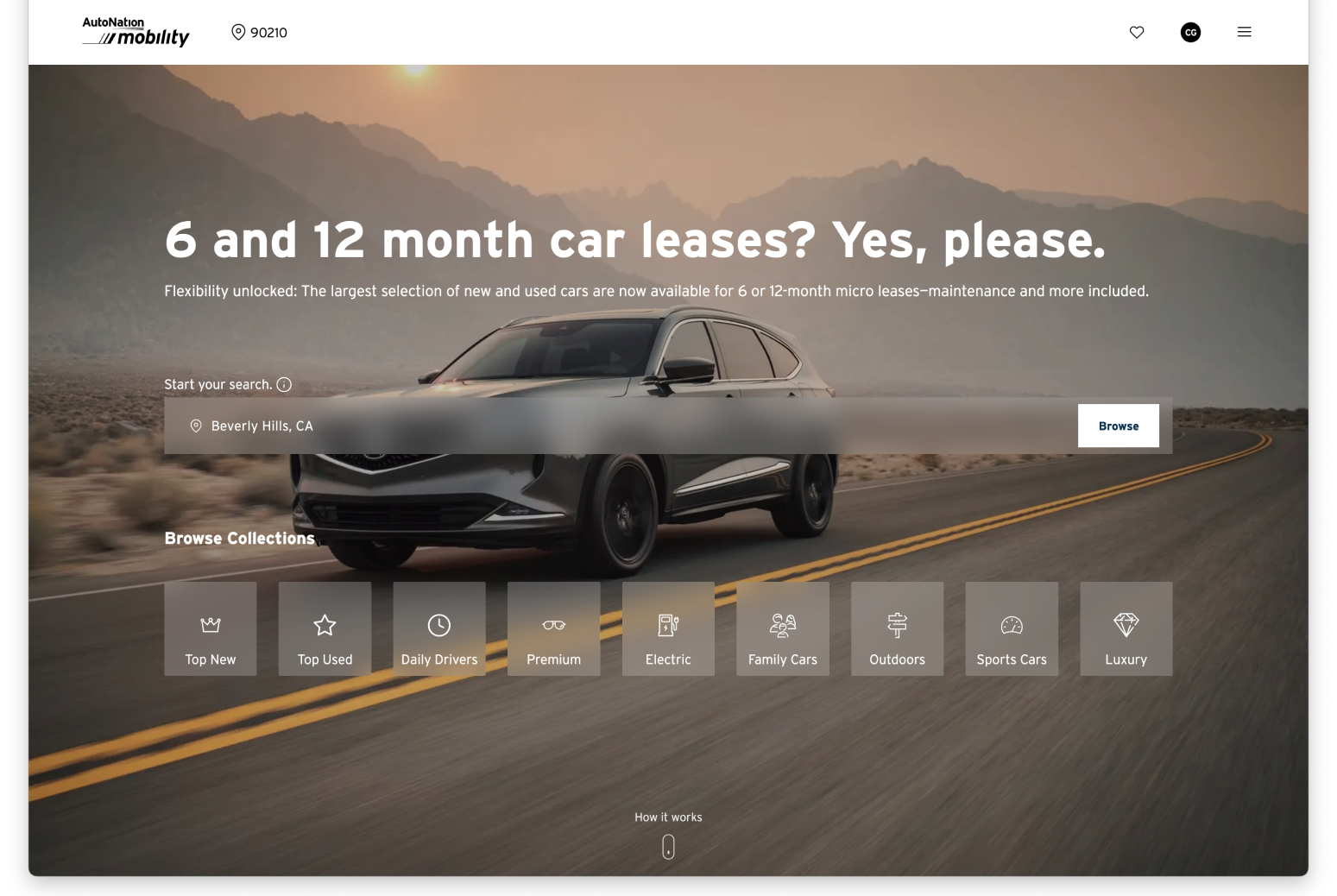
AutoNation Mobility is a zero-to-one product from AutoNation. Users looking for short term leases or long term rentals can “micro lease” their vehicle for 6-12 months. The shopping and lease transaction process takes place fully online until they head to the dealership to pick up the car.
IMPLEMENTING FAVORITES
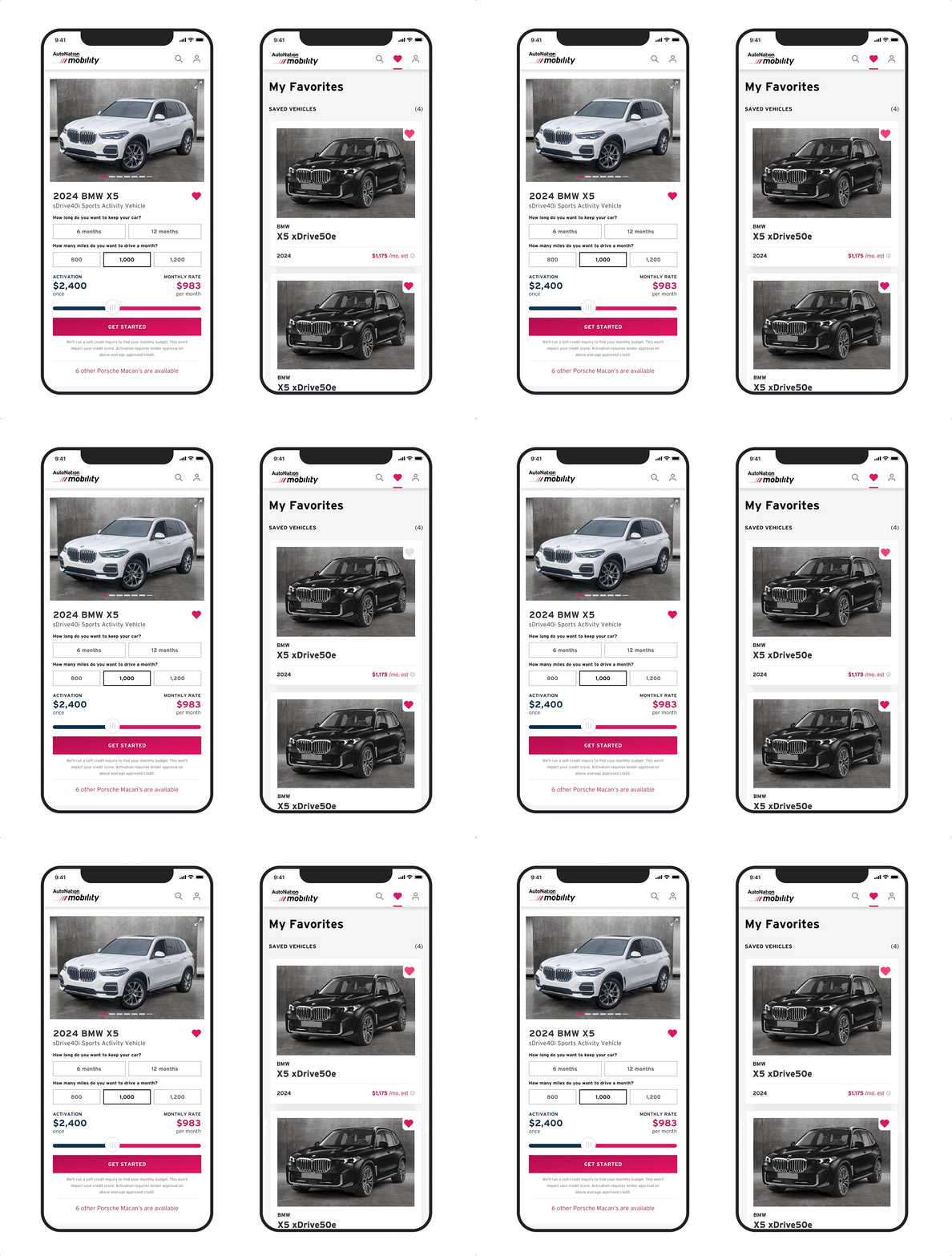
Allowing users to collect their favorite vehicles and compare details leads to shorter transaction times and increased account creation and completed pre-qualifications. For many of the users, the stakes are high because they are trying to balance researching new vehicles and comparing rental prices to lease and loan prices. They usually have a deadline of when they need a vehicle, and any ability we provide to help the user compare and transact with confidence is a win.

MY ROLE
Research, Interaction + Visual Design
Tools: Figma
Timeline: 4 Weeks
INTENDED OUTCOMES
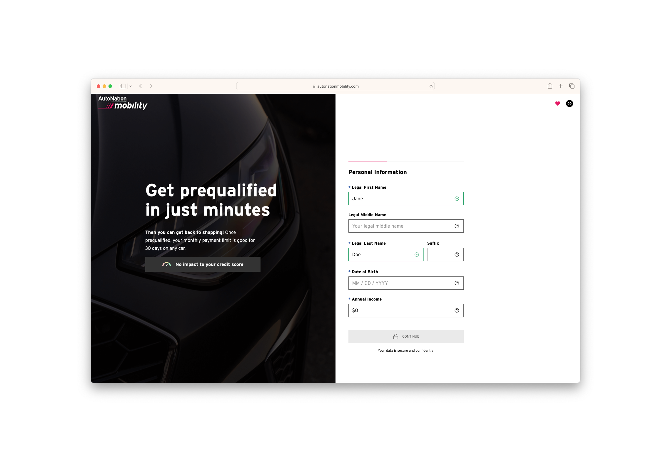
How might we implement saving vehicles to allow users to collect and compare favorites while increasing account creation, increasing pre-qualifications, and impacting conversion?

PROCESS
I began with proto-personas developed by our UX Researcher and Customer Service team. I conducted a competitive analysis focusing on the interactions and account creation piece. I then ideated and worked through iterations on interaction and visual designs.
RESEARCH
Utilized a proto-persona while designing
Our UX Researcher and Customer Service team (plus other stakeholders) put together proto-personas for design and marketing use. The proto-persona I was designing for was the Planned Pragmatist. This user has a more urgent need over time, is typically someone waiting for newer vehicle models yet needs access to a vehicle now. Other use cases included older adults looking for a temporary vehicle for children about to start college, or someone planning to move to or work from a new city where their living situation is temporary. Main personas for the Mobility product:
Treat Yourself - a short term splurge
Unplanned Need - urgent need after a sudden event
Planned Pragmatist - getting a vehicle for a short period of time is an expected, planned need, and the user is on a budget
Efficiency Seeker - wants the most convenient way to get a vehicle
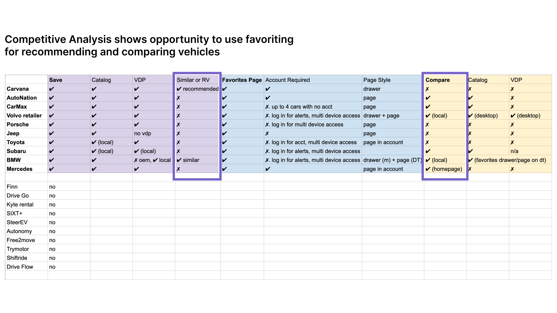
Conducted competitive analysis to get a wide view of a common feature
Key Findings:
Among competitors and sites where users may be comparison shopping, there is a huge opportunity to use favoriting for recommending vehicles.
There is a good future opportunity with a dedicated comparison feature.
As straightforward as favoriting sounds, experiences were wildly different depending on account status, or global vs. local car brand sites.
Conducted an audit of competitive and comparative account creation modals
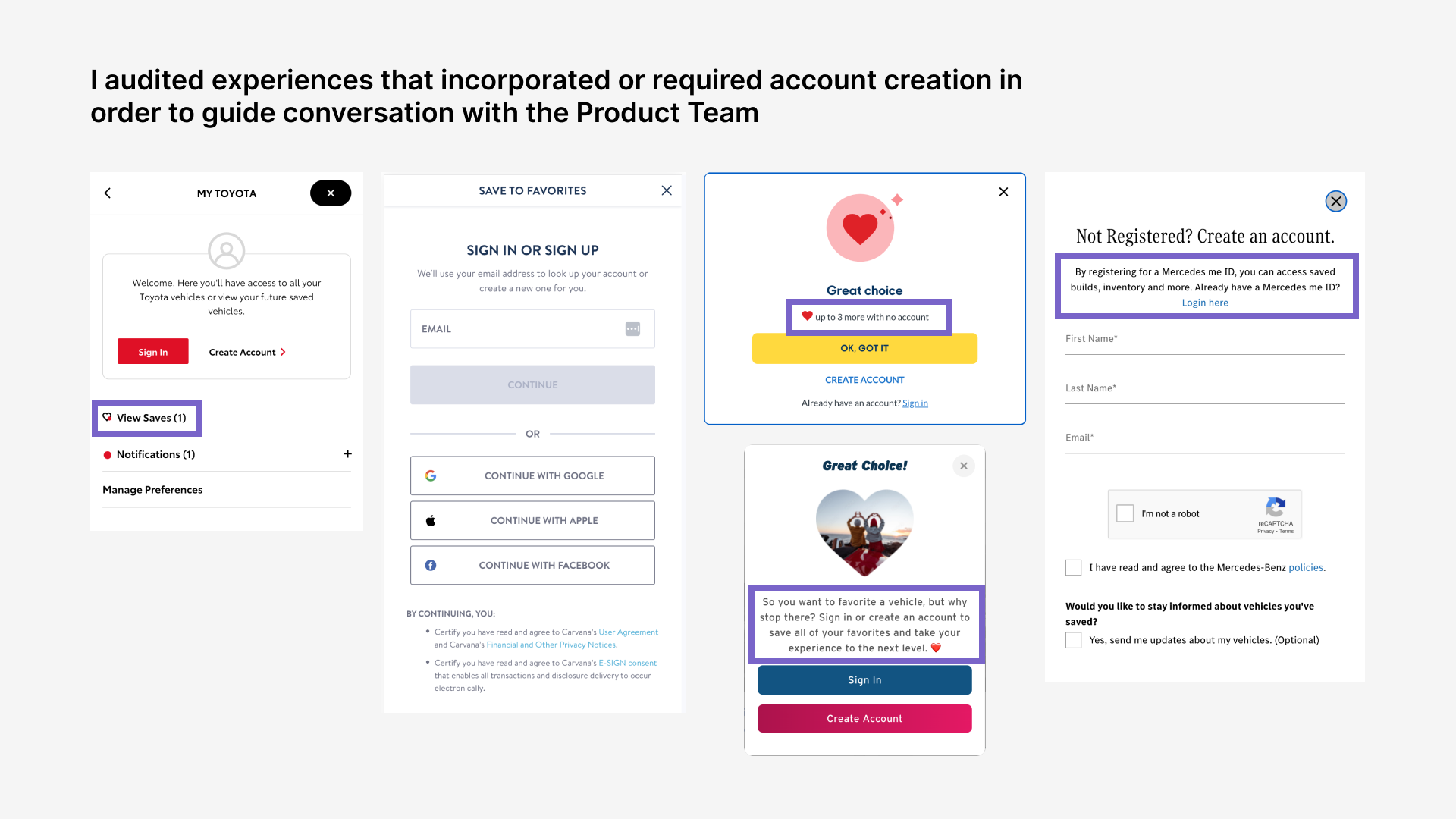
After reviewing the research and audit with my Product Manager, we developed the following requirements:
An immediate requirement to create an account feels too transactional. We should allow 3 saves before prompting to create account.
User should be able to see recommended or unavailable vehicles on a dedicated favorites page.
We need to promote next steps to help the user move through the process of micro leasing a vehicle.
IDEATION
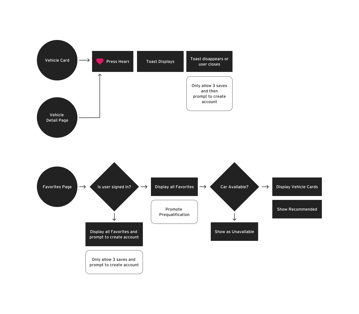
FLOW
I put together a user flow to determine how to incorporate account creation and discuss logic with engineering. The user can start from the vehicle card or the detail page. After saving three vehicles they will need to create an account. On the favorites page, we can suggest vehicles and next steps.
ITERATIONS
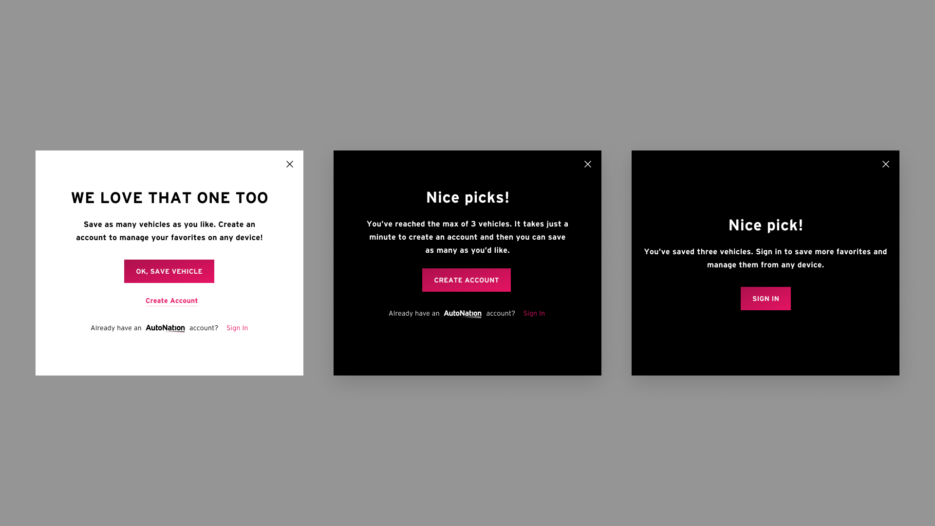
EXPLORED MODAL TREATMENTS
Since we were building out our design system, there was not a specific modal component. I iterated with this in mind and explored various visual treatments, logic, and then copy for this specific account creation application. Since I was working on this in tandem with the toast system, I opted to go with a dark modal to keep things consistent.
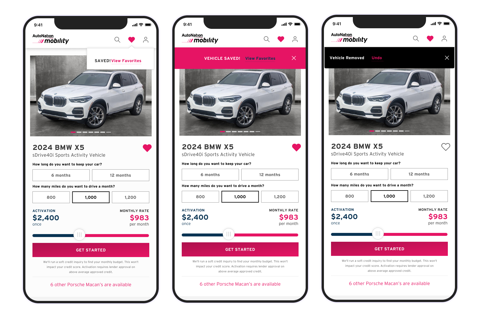
IMPLEMENTED TOAST SYSTEM
There was also no toast system in place. I iterated on visual design with critique from my design team. I chose the black toast so that it stood out against the various hero elements (unlike the white toast version) but was not overly distracting or identical to the website banner (pink version). I then partnered with front-end engineering to customize a react toast system and fine tune the firing logic. This involved collaboration and Design QA after the system was implemented.
ARCHITECTURE
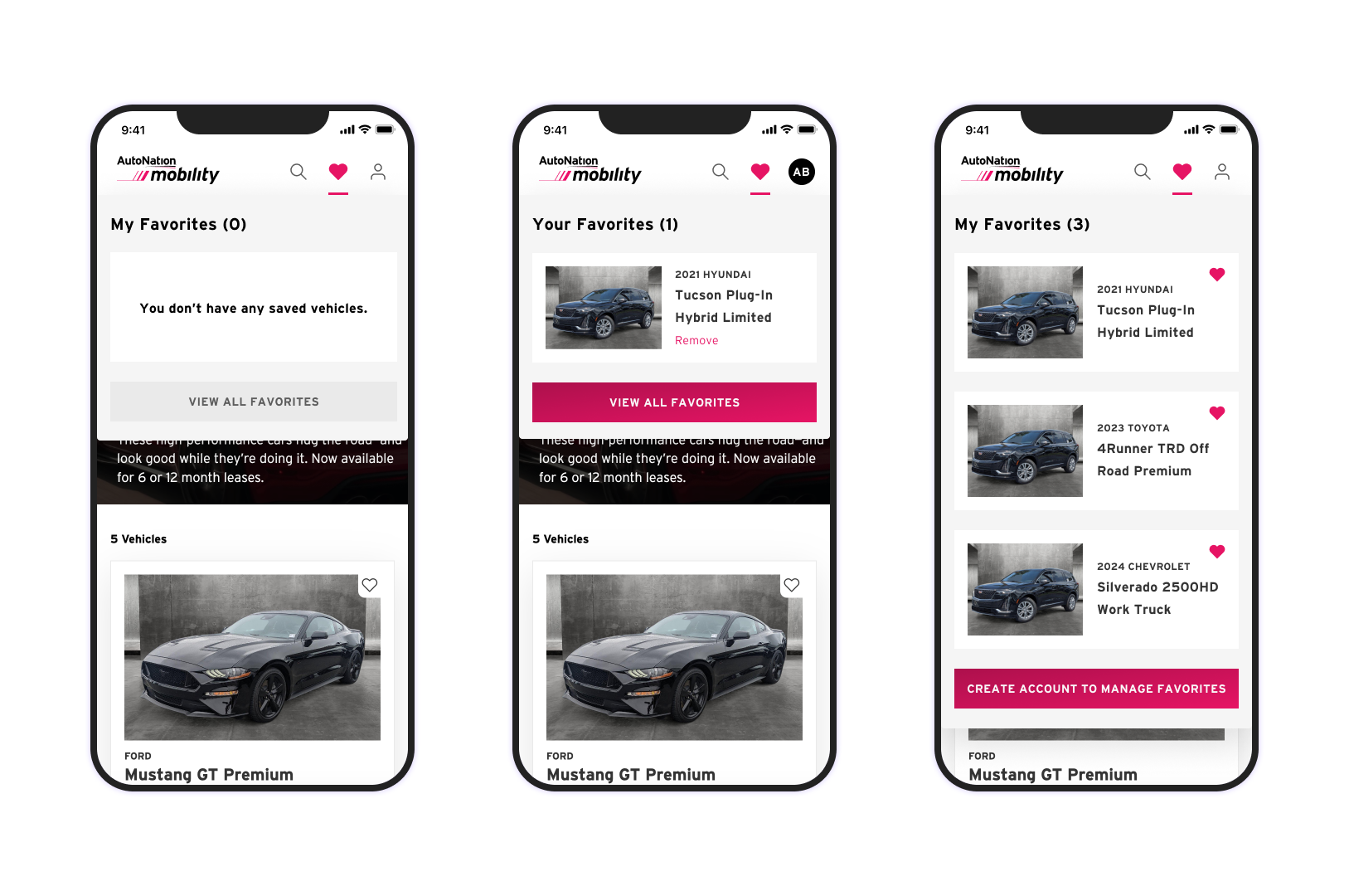
CREATED A QUICK-VIEW DRAWER
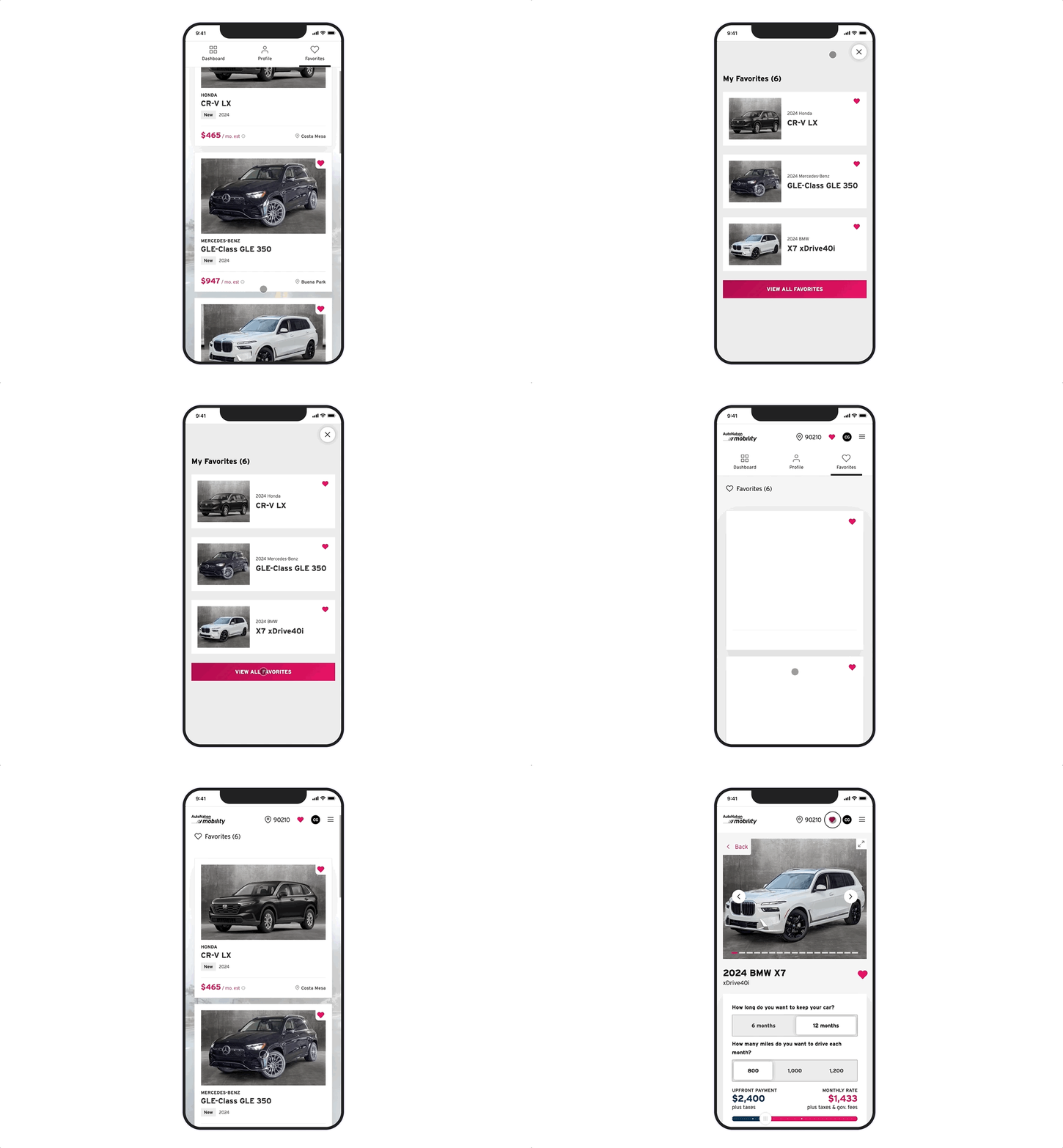
In addition to the toast system, I wanted the user to be able to quickly reference their recent saves. Since we hadn’t decided if the full collection page would live within the user’s account or as a separate page, I felt that a quick reference drawer would keep the user in the shopping context while allowing them to quickly see their last 3 vehicles. This is also consistent with several competitive experiences. By only showing a maximum of 3 vehicles and CTA, I kept the drawer within the viewport and created a flexible way to route the user to either a favorites collection page or to account creation if they were unauthenticated.
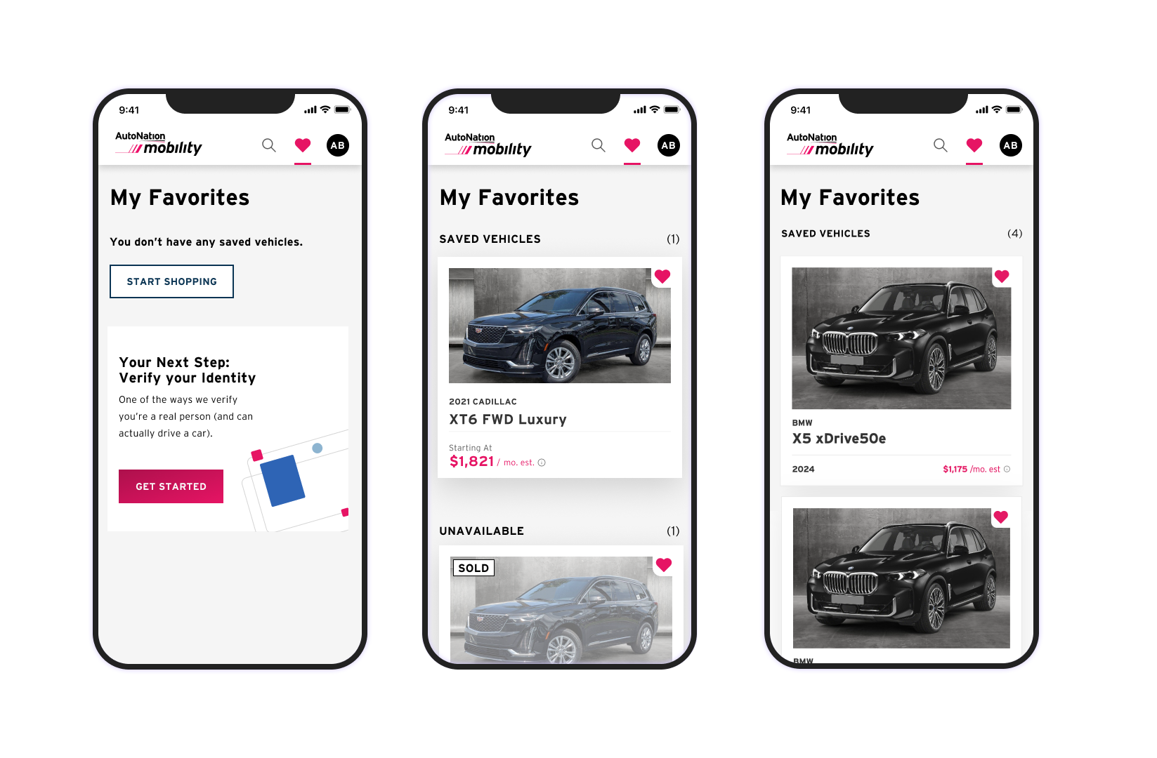
ESTABLISHED A COLLECTION PAGE
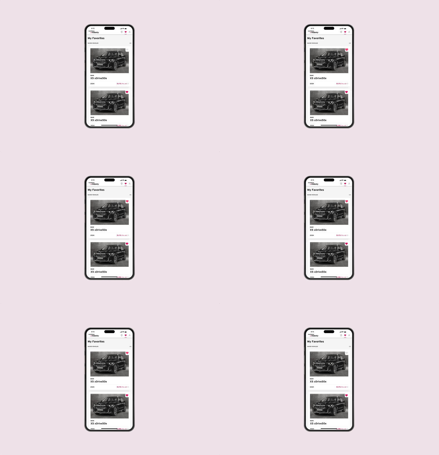
I developed the hierarchy and content for this collection of favorites as a stand-alone page so that we could get started on development and transfer this to the account architecture since that was being designed and developed simultaneously. The goal for this page was for the user to access everything they have saved, and to give us the home of any future comparison features. This is also an opportunity to serve recommendations and next steps to the user.
One of the goals of this project is to increase account creation and pre-qualification. I added in promo cards to this page that will prompt the user on their next step based on whether or not they have completed the step to create an account or get pre-qualified. These promo cards were a reusable component utilized elsewhere on the site, and kept messaging consistent for the user.
SHIPPED DESKTOP AND MOBILE FLOWS
UNAUTHENTICATED FLOW ON DESKTOP
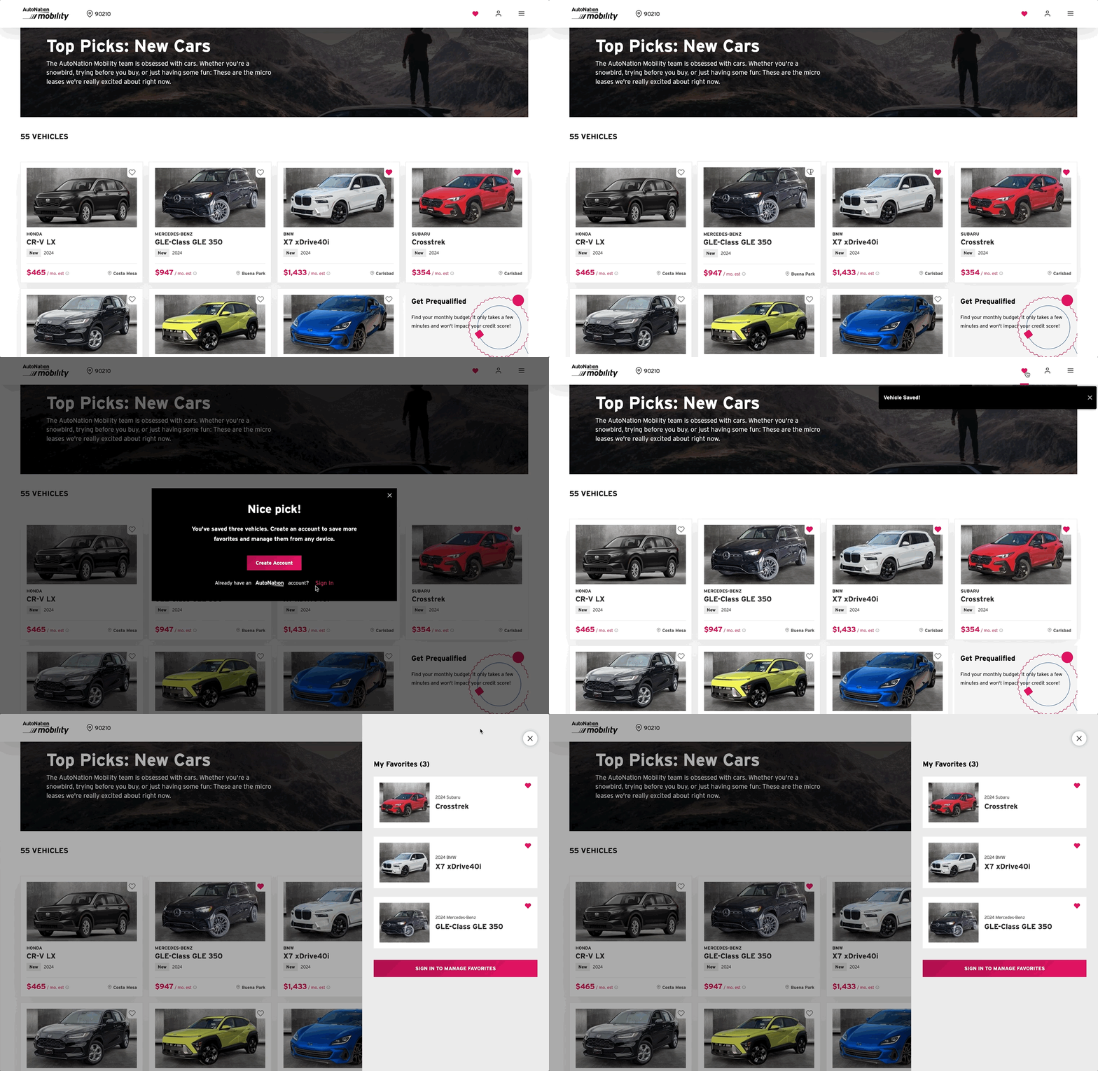
AUTHENTICATED FLOW ON MOBILE
OBSTACLES & NEXT STEPS
I navigated several changes to the architecture of accounts which impacted the quick view drawer and collection page.
Working with engineering I discovered that showing unavailable vehicles was not possible due to how we received inventory feeds.
To get the MVP live, we had to push implementing recommended vehicles on this page. This will be a next step to iterate on the project.
IMPACT
Customers coming to Mobility from search are using Favorites more than those coming from other sources (social media). The hypothesis is that these users are early in their vehicle search and most likely consistent with our planner proto-persona. Of the users that transacted, the ones using favorites transacted in an average of 5 days compared to 10+.
Analysis of other metrics such as increased account creation and pre-qualification is ongoing.
“Of the users that transacted, the ones using favorites transacted
in an average of 5 days compared to 10+.”