
Blue Nile - Gemstone Education Redesign
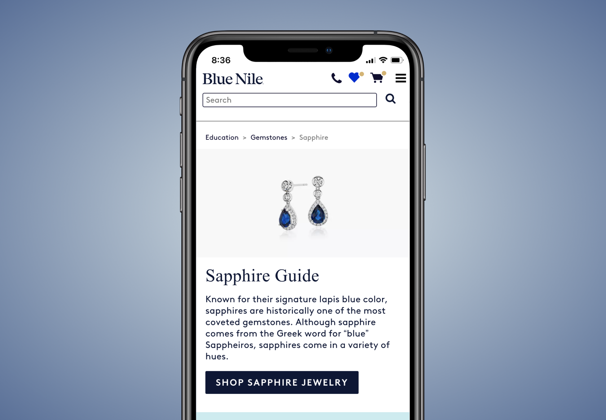
GEMSTONE EDUCATION REDESIGN
I collaborated with the Director of Product & Content, other UX Designers, a copywriting team, SEO and engineering to redesign the gemstone education experience at Blue Nile.
OPPORTUNITY
Blue Nile is the leader in custom handcrafted engagement rings and fine jewelry. A large part of the inventory is gemstone jewelry, but Blue Nile did not have the breadth and depth of educational content that customers are searching for. This project seeks to revamp the content and architecture of the gemstone education section to better serve the kinds of topics customers are looking for and to better drive customers to related merchandise.
MY ROLE
I conducted secondary research, designed new page templates and components that could be used across those templates, and contributed to final visual design. Scope: I focused on my portion of the research and design for about 3 months
Constraints: Use components from the existing design system as much as possible. If a new component is needed, try to make sure it is reusable.
PROCESS
Taking the research provided to me, I started working on assembling some of the cross-content modules that would utilize currently existing design system components. The content for several of the main pages was already written by the copywriting team with the html markup defined by SEO.
After putting together the modules and content that we had ready to go, I started identifying what new components would be needed to meet the goals for the rest of the content:
Defined layout for long form paragraphs. Researched best width for article type content on desktop.
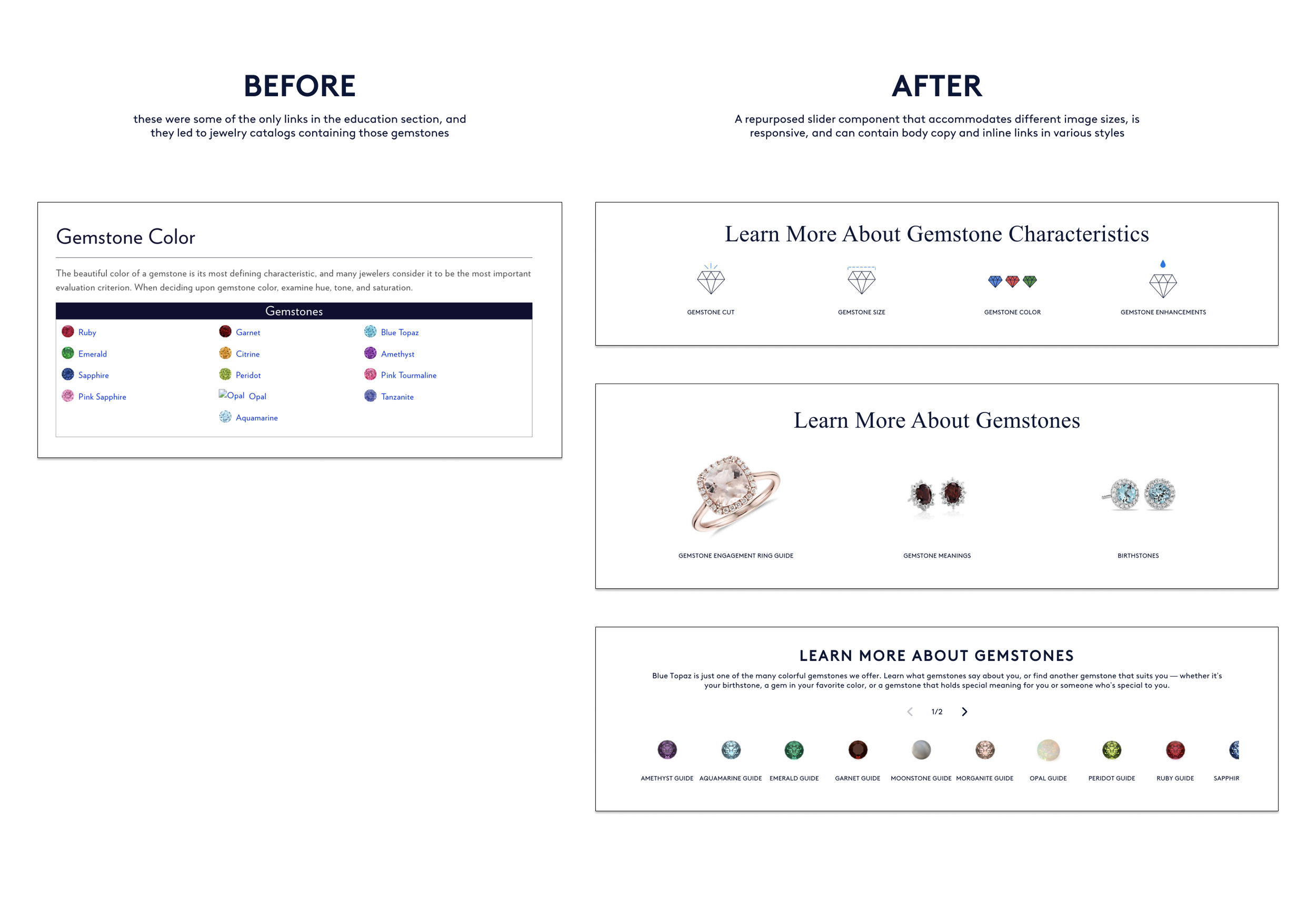
Side and subtopic navigation container for effective crosslinking. Re-purposed a slider component with some modifications to help speed up development.
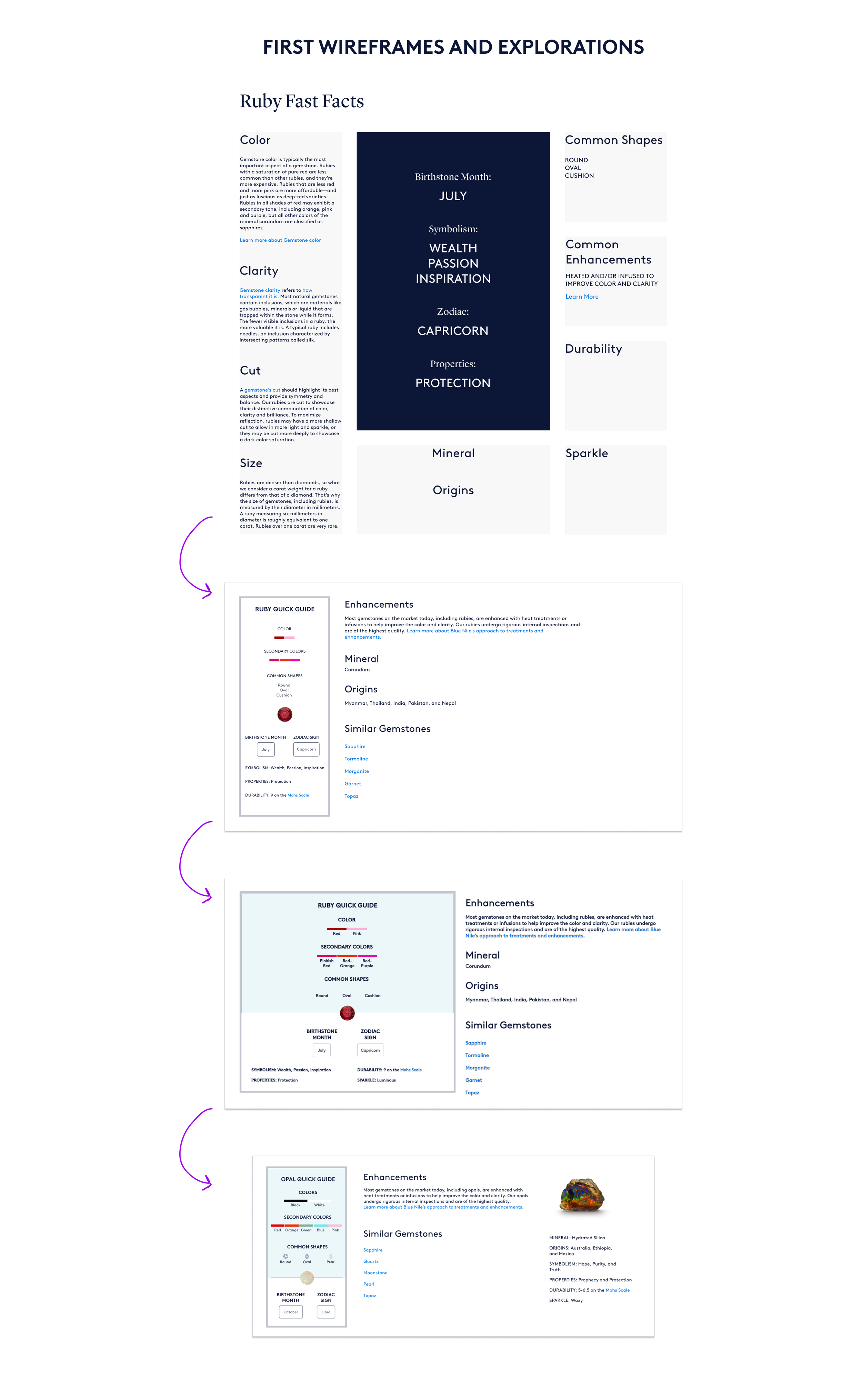
A way to creatively display different facts or features about a gemstone. Researched and Ideated new layouts.
Buying tips or a numbered list. Defined text width and created new icons.
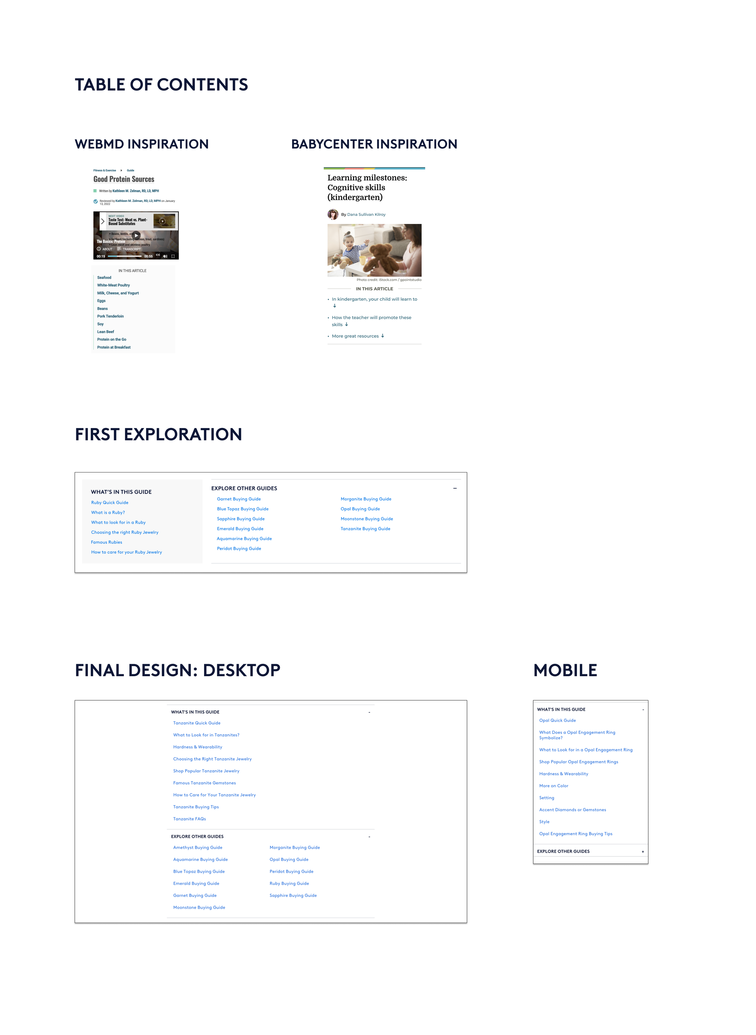
Table of contents. Inspired by a few other educational guides online, I repurposed an accordion component with some modifications.
New Component: Long Form ParagraphS
“The optimal line length for your body text is considered to be 50-60 characters per line, including spaces (“Typographie”, E. Ruder). Other sources suggest that up to 75 characters is acceptable.” - Baymard
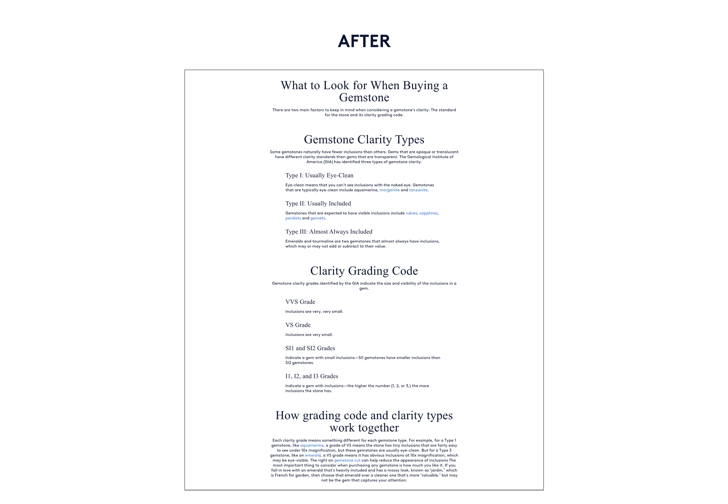
With a 560-pixel wide article container, we would end up with about 70 characters per line. Due to constraints with our design system, we were able to create a container with 256px gutters for desktop, which resulted in an approximately 630-pixel wide container for paragraphs. This puts the intro text length around 90 characters, and indented text around 75 characters. This was acceptable for release and we could monitor or test to see if we should find a way to improve this further.
New Component: Side and Subtopic Navigation for crosslinking
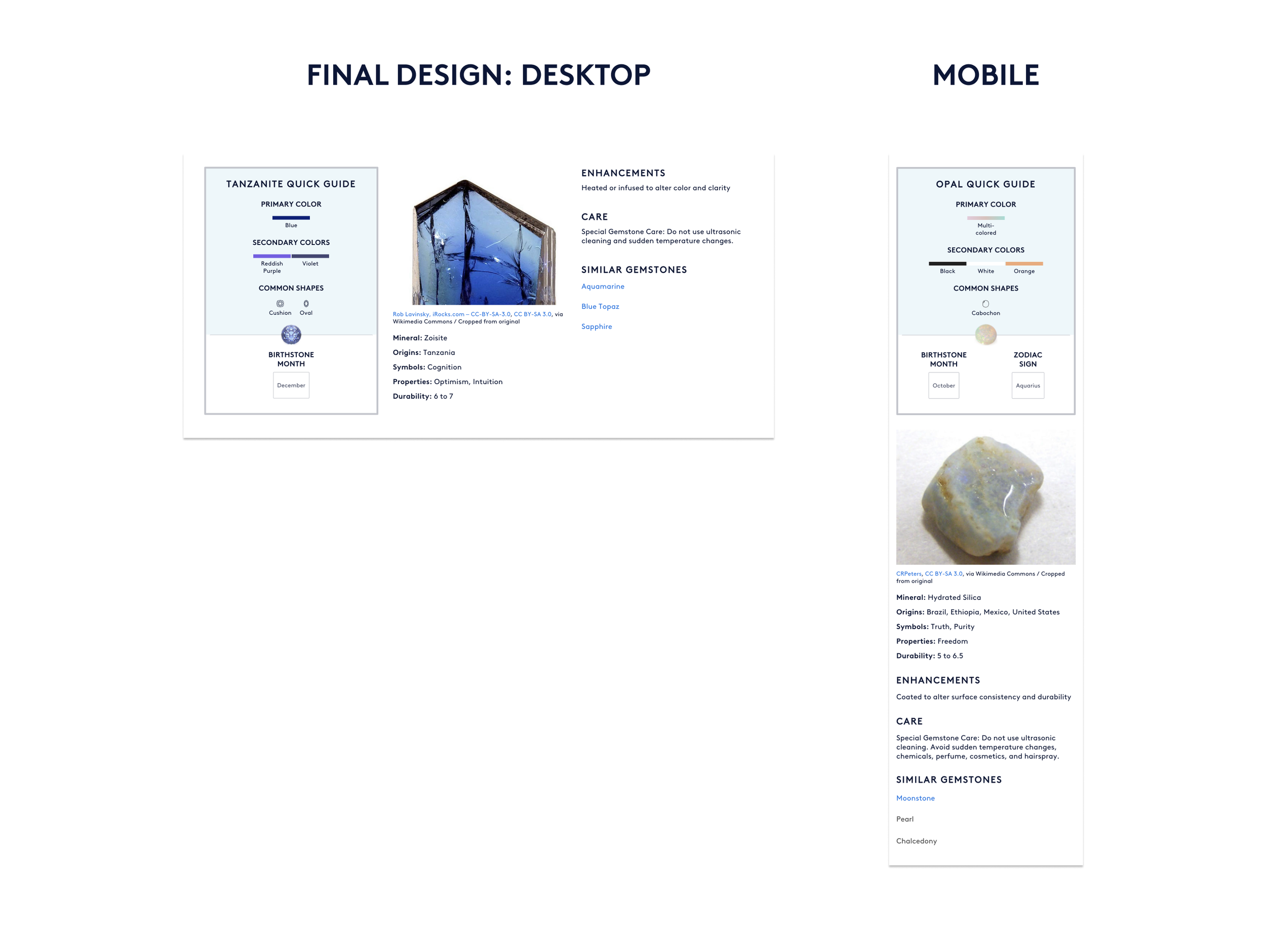
New Component: Gemstone Facts
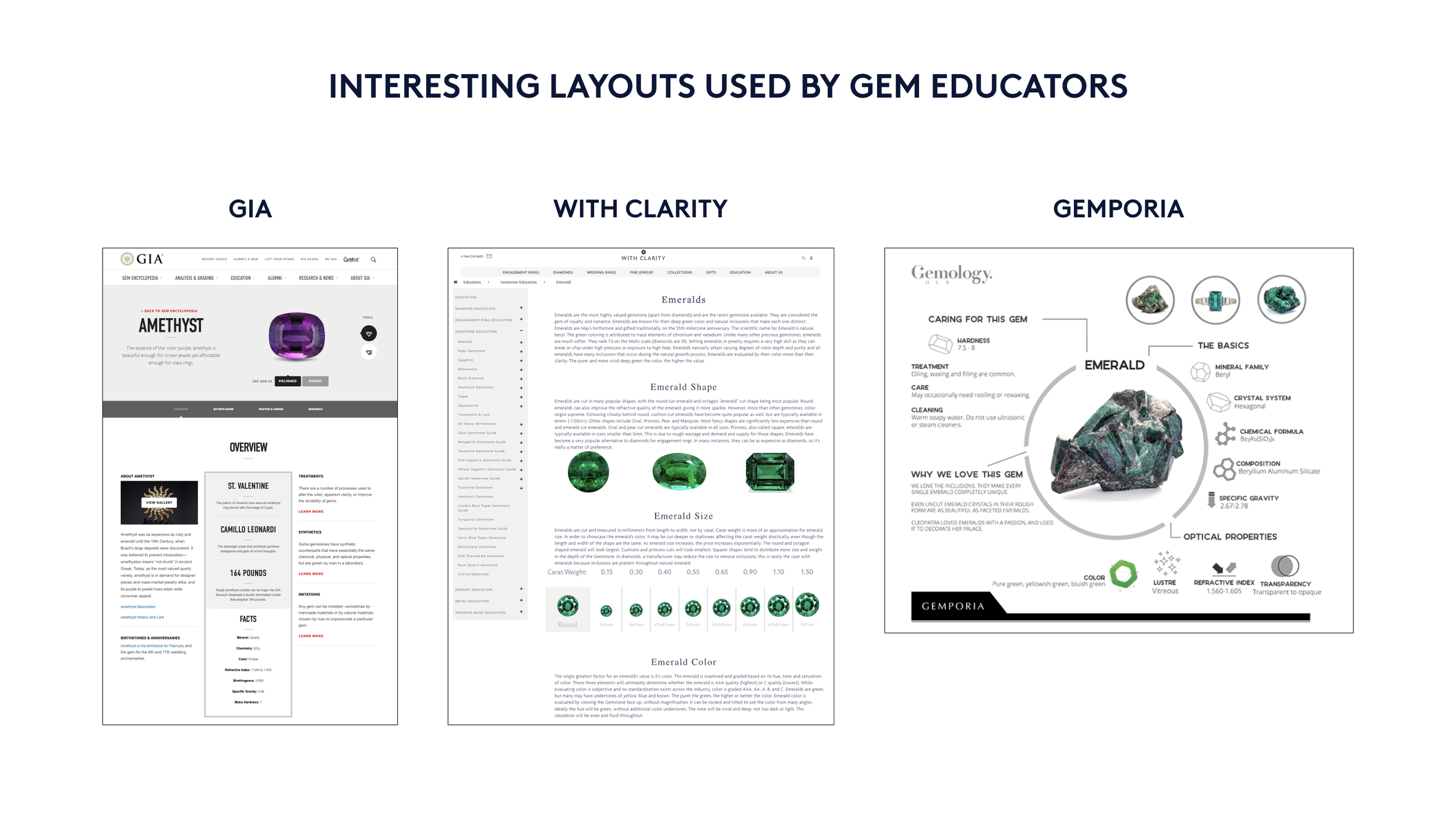
The most time consuming new component was a module that helped display an array of facts in a visually appealing manor. This component would go on nearly every page involving a specific gemstone, so it would help the user to quickly learn more about that particular stone, whether it was to learn about the stone as a birthstone or as a gemstone set into an engagement ring. The content and copy team determined the exact stones, the images of raw stones, and the list of facts. I also utilized gem images used elsewhere on the site to create icons for a section of the module. To get started on this component, I reviewed the landscape of gem education to see how other gem educators were presenting this information. I then came up with wireframe explorations and reviewed the modules with the team. After several iterations, the final design resulted in a three column desktop view that would stack in mobile.
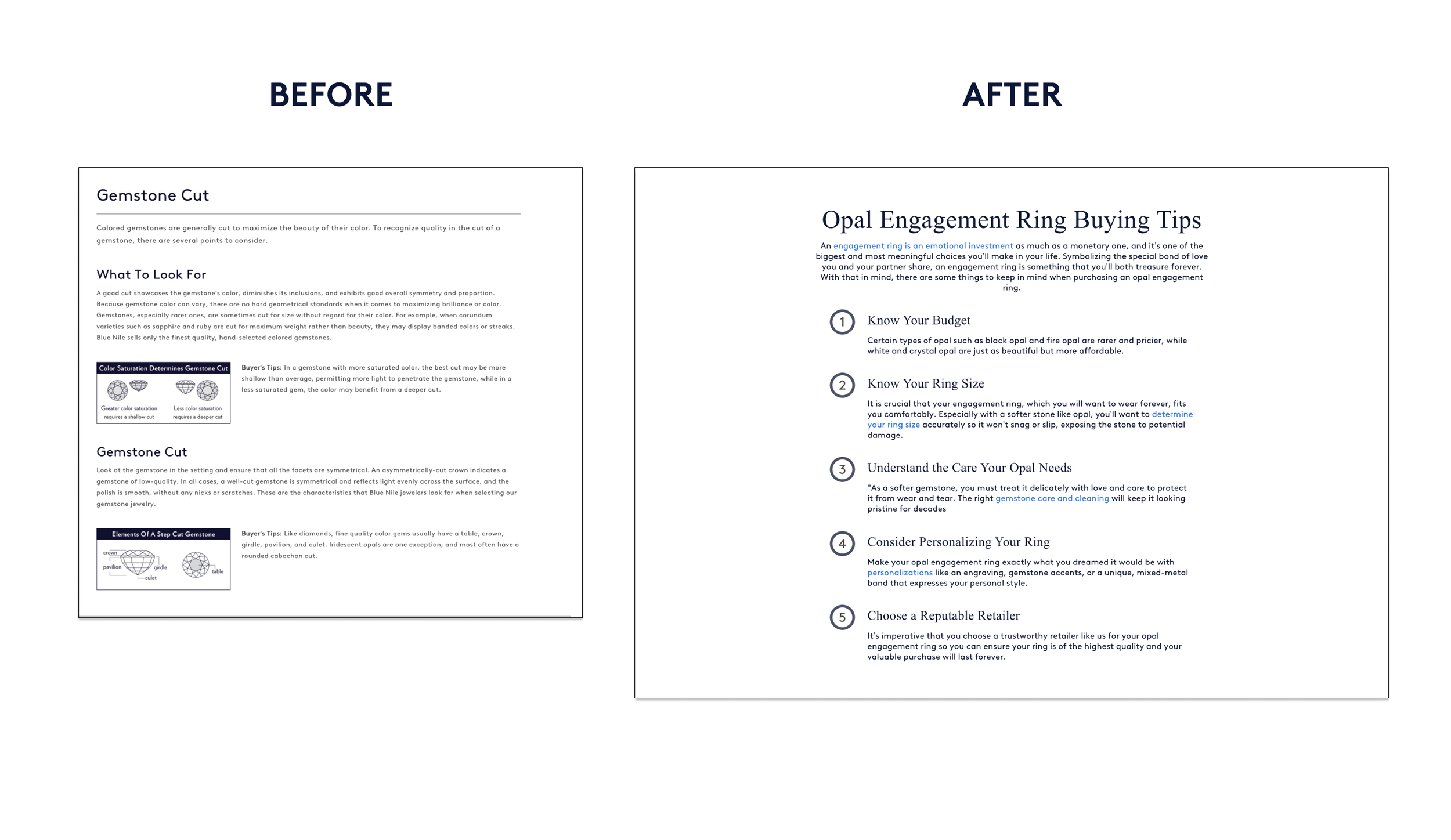
New Component: a short numbered list
One of the things we noticed about the new content was that many of the different page types would need to have a short numbered list. This included buying tips, things to know, or a list of related content. We wanted to make this visually interesting to help draw attention to the list, rather than just having small numbers in the body copy. I developed icons and worked with engineering to align these within the text container.
New Component: Table of Contents
During a UX Team review of one of the gemstone pages, we realized that there was a lot of content on these pages. Especially considering all of the enhanced body copy sections and the crosslinking and link bank components at the bottom of the page. We wanted to give users a way to scan what was on the page without having to scroll. I found inspiration in some other educational sites such as WebMD and Babycenter that utilize a table of contents for articles.
The most readily available component that we had was an accordion, and I repurposed that to contain anchor links in the drawers. I explored having a contrasting section next to an accordion but this would require extra development time to heavily modify the component. The final design was an accordion with two drawers so that if we needed to add sections in the future, that could easily be done.
While working on these new components, I also created templates in Figma for the main page types.
Engineers used the template alongside a content matrix to start developing the new content.
FINAL PAGE DESIGNS BEFORE AND AFTER
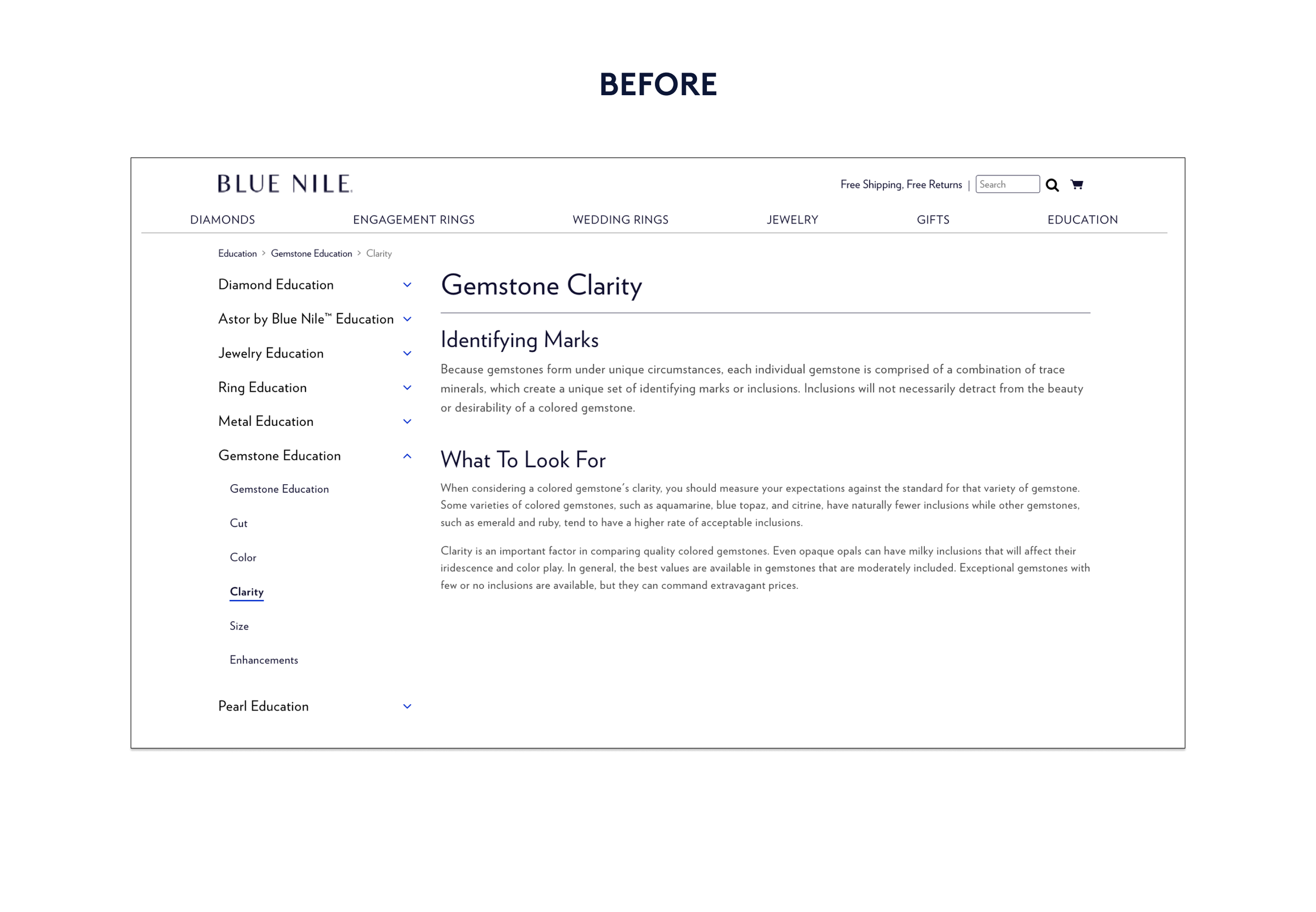
The image below shows the previous version of the Gemstone Education Homepage alongside the updated version at the end of the project.
The mobile view shows the gemstone education subpage where a user can drill into a specific gemstone to learn more.


PROJECT IMPACT
The SEO and Product/Content Directors monitored the A/B test post release, which was late 2021. Final release of all content to 100% treatment was 3/10/2022.
The new education section performs better than the old section in every content strategy marker:
Discoverable: 63% improvement in organic sessions (927 vs 468)
Compelling: better bounce rate (56% vs 66%)
Commercial: 250% increase on sessions with add to basket
QUALITATIVE IMPACT
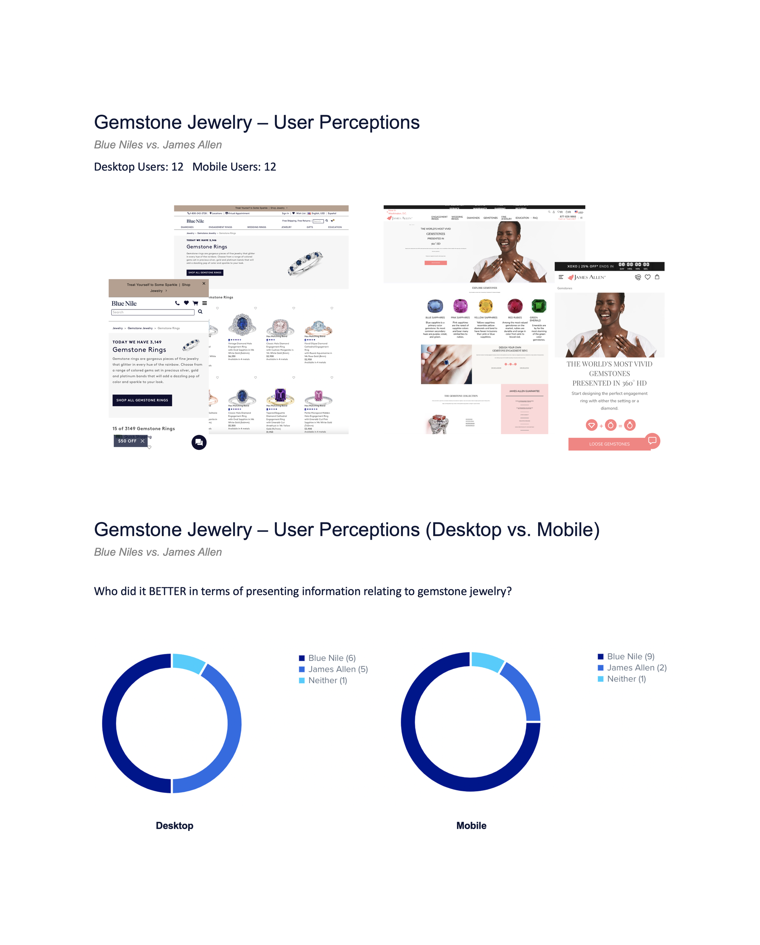
In January 2023 after Blue Nile was acquired by Signet Jewelers, our UX researcher conducted a comparison test on usertesting.com to get user perceptions of the gemstone education experiences on our site and our competitor James Allen’s site.
Blue Nile was rated more favorably on every question, such as:
How would you rate the overall experience?
How would you rate the overall aesthetics?
How easy or difficult was it to discover and choose gemstone jewelry? Who did it better in terms of presenting information relating to gemstone jewelry?
Between the two websites, which do you prefer in general?
Which was easiest to use?
“The new education section performs better than the old section in every content strategy marker. It is 63% more discoverable, is 10% more compelling, and there is a 250% increase on sessions with add to basket.”
NEXT STEPS
Find ways to improve on the intro text layout vs. the long form component. There are some intro sections that are too long and should be moved to a long form container.
Research and investigate the main education landing page and explore opportunities to integrate new templates and improve information architecture and navigation. This would help boost one of our highest traffic sections: Diamond Education.