
Chihuly Website Redesign
Sed vitae enim egestas, congue arcu et, efficitur augue. Cras sit amet venenatis est. Sed pulvinar sodales lacus sit amet placerat. Nulla facilisi. Integer pellentesque semper magna vel pellentesque. Cras imperdiet tortor sit amet erat aliquet rutrum.

CHRISTMAS SHOPPING
AT CHIHULY
Optimizing the Chihuly Garden and Glass Bookstore website for picky Christmas shoppers

OPPORTUNITY
This is the story of rapidly redesigning and iterating an interface with a specific set of user behaviors and goals driving decisions.

MY ROLE
For this sprint, I primarily focused on Competitive Research, Information Architecture, and Interface Design.
Timeline: 2 week sprint

APPROACH
I began this redesign by analyzing the persona given to me by General Assembly. I worked with the behaviors to complete an unsolicited redesign of the Chihuly Garden and Glass Bookstore website. I conducted Competitive research and analysis in order to examine current practices and justify a business position for a redesign. To get a feel for potential new IA through user research, I set up a digital card sort. From this research, I moved forward with developing a pitch, sketches of a redesign, wireframes, and a clickable prototype. My focus was on improving the browsing capability and highlighting the brand.

PERSONA BEHAVIOR
Diligently hunts for exactly the right ‘cool’ thing
Shops brands, but buys for price
Buys items that reflect status
Searches for thorough product descriptions
Buys from familiar retailers

CURRENT BOOKSTORE HOMEPAGE
I began by blocking out the current homepage and conducting an informal content analysis. I learned that there is a large number of product categories, and there are some categories with little to no merchandise. I also noticed that when browsing products, the browser back button must be used to return to the previous page. It feels like the equivalent of being stuck in the corner of the store.
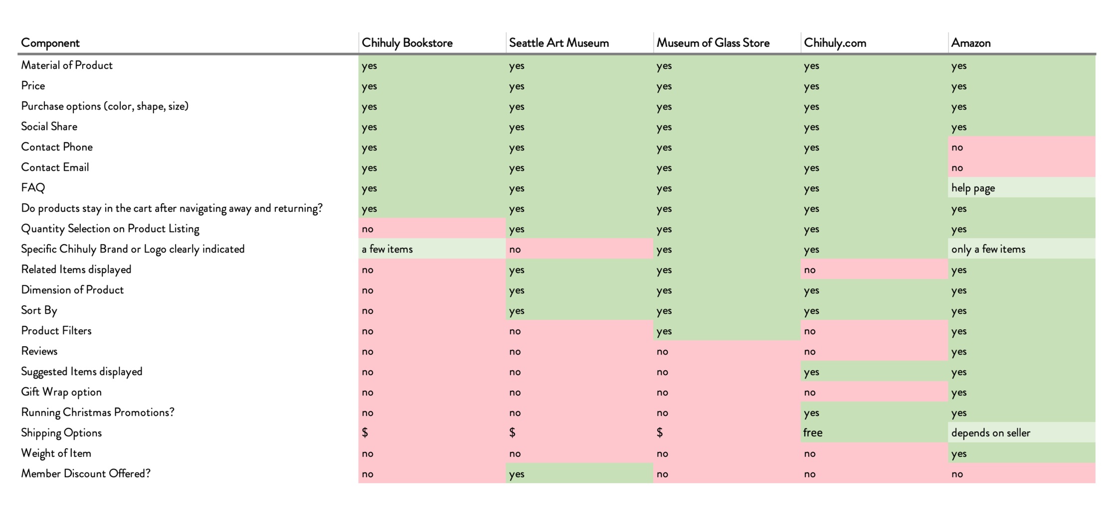
COMPETITIVE ANALYSIS
Chihuly Bookstore lacks components for product reviews, sort, filter, as well as other browsing capabilities that are used by competitors.

COMPETITIVE ANALYSIS: Amazon
Amazon brings selection and efficient shipping to the table.
Strengths: Prime Shipping, large selection, excellent browsing ability (sort, filter, etc.), suggested items, reviews.
Weaknesses: Mostly carry Chihuly ‘style’ products, (very few Chihuly branded items), any gift wrapping would be Amazon branded, not Chihuly.

COMPETITIVE ANALYSIS: Seattle Art Museum
Seattle Art Museum has excellent gift shop offerings with a variety of products available. Featured items include products corresponding with exhibits and products from local artists.
Strengths: Some product variety, Member discount, display related items.
Weaknesses: They do not carry Chihuly brand products. Also, It is difficult to know if you have looked at all products. They have breadcrumbs, but no clear categories or filters.

COMPETITIVE ANALYSIS: Chihuly.com
This is the hub of content on the life and work of Dale Chihuly. It features exhibition and press information, as well as a tasteful shopping section. This site is the main competition for Chihuly Garden and Glass Bookstore.
Strengths: Holiday Free Shipping, all official Chihuly merchandise, great tone to promote exclusivity of the brand, item suggestion.
Weaknesses: There are no clear breadcrumbs, and if you wish to browse all items, you must return to the store homepage. No filters.
I conducted the competitive analysis and comparisons in order to understand the competition facing the Chihuly Garden and Glass Bookstore. The picky gifter persona is likely to visit any of these sites, since they like to search for thorough product descriptions, brand items, and familiar retailers. To justify a site redesign, I prepared the following pitch:

Before working on the interface design, I wanted to conduct a card sort to see if the top navigation and some of the site sections could be better organized. The Chihuly Garden and Glass Bookstore website is a part of the venue’s website, and traffic is directed to the ‘Shop’ page from the main website www.chihulygardenandglass.com. The card sort data below illustrates that most users sorted the website content into an About or Bookstore group.
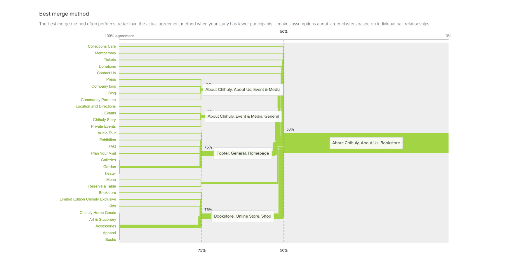
Potential Top Navigation categories: BOOKSTORE (SHOP), HOME, ABOUT


To keep existing terminology, I would suggest grouping the items categorized as HOME into a VISIT section, so that all general venue and homepage items would be grouped together, while any history or story related items would be grouped into the ABOUT section. I would suggest maintaining the Blog section, as this is consistent with the competitive research. I would also recommend a few changes in the SHOP section. Create a separate Chihuly Glass section would highly illuminate the brand for a picky gifter. Additionally, simplifying the STATIONERY clarifies that the items in that section are not Chihuly art, but are stationery with art printed on it. I would also recommend renaming the KIDS section to GIFTS FOR CHILDREN, since users indicated during the card sort that a title of KIDS was confusing (they thought it indicated activities or tickets related to Kids). Last, adding a VIEW ALL section would help the picky gifter view everything in one place so that they could filter and sort any category. In additional sprints of this project, I would actually split this card sort into two. I would conduct one for shop items and another for the top navigation. I also did not have a large number of participants, so I would want to get more users for additional data and a better view of the potential Information Architecture.
BLOCKING
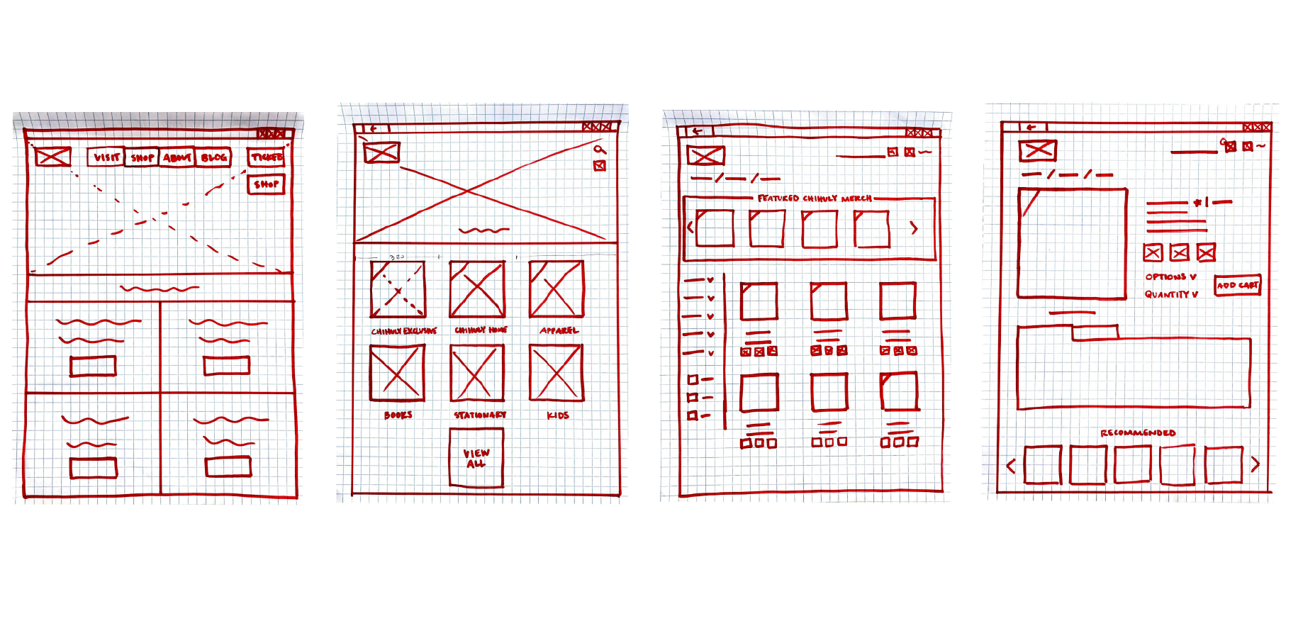
I blocked the current home screen of the main website, with a few updates from my Information Architecture research. I blocked out these pages so that I could start working in Sketch.
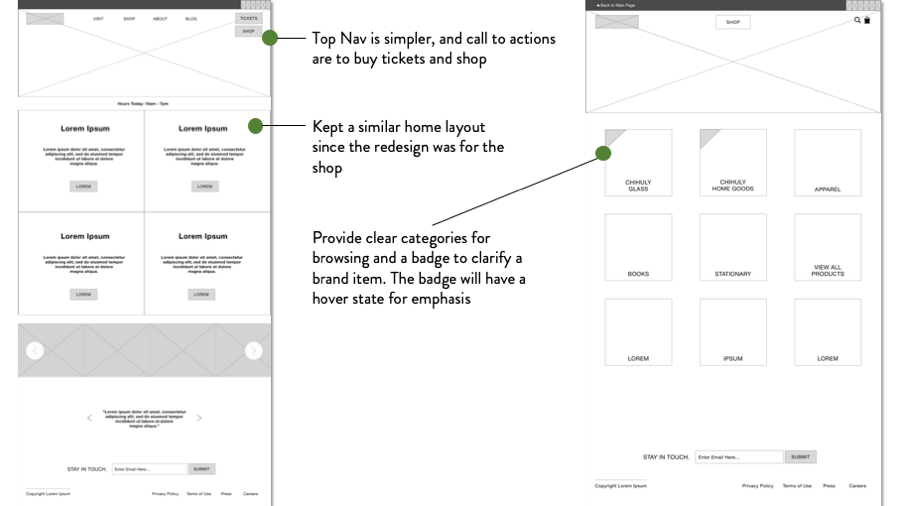
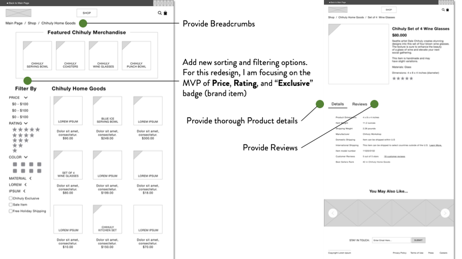
VERSION 1 WIREFRAMES
Homepage for the main site and the Bookstore shop homepage
VERSION 1 WIREFRAMES
Product Categories and Product Details
VERSION 1
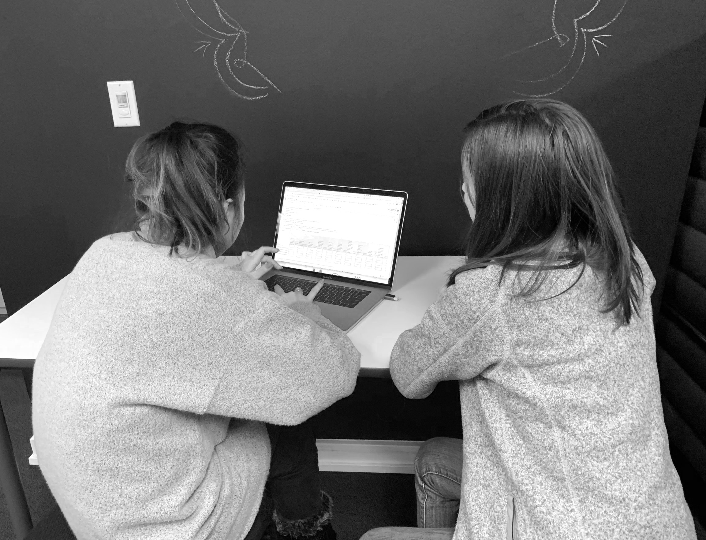
USABILITY
Failed due to no visible Add to Card button
Next Steps:
Create an Add to Cart button, update spacing for product reviews and details, create more screens for browsing
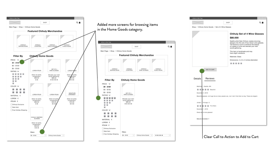
VERSION 2 WIREFRAMES
Focusing on browsing and a clearer call to action

VERSION 2 USABILITY
SUS Score: 87.5
Next Steps:
Add screens for more browsing capability with the brand checkbox “Chihuly Exclusive”
Add screens so that someone could complete the task (find the wineglasses) through either Home Goods or the Glass category
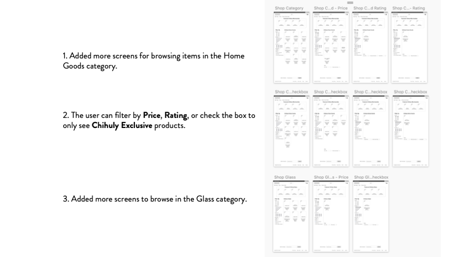
VERSION 3 WIREFRAMES
Add more screens to expand options to filter products or browse other categories

VERSION 3 USABILITY
SUS Score: 90
Next Steps:
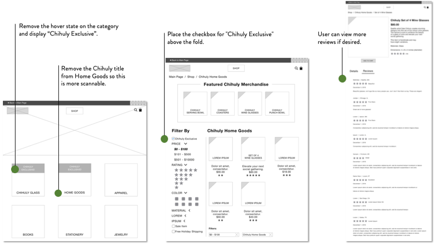
Fix type errors, clear up the hover banner on the product icon, make product titles more scannable, allow reviews to expand
User said she missed some of the categories because they all started with the title “Chihuly”. She also kept searching for an indicator that something was exclusive.
VERSION 4 WIREFRAMES
Cleared up the Shop home page to draw eyes to Exclusives and brought the Exclusive filter to the top of the fold

NEXT STEPS
• Mockups and Sample Content
• Filter by Sale items or Promotions
• View or apply shipping deals
• Gift wrap options
• Add Review
• “Sort by” option
• More research with the business directly about additional merchandise and member discounts