
Attend
UI/UX

ATTEND
Engaging students and after-school counselors in Seattle Community Centers

INTRO
Attend is a native Android mobile app created as a concept application while I was a student at General Assembly. The project brief was to create a solution for a social issue. My team decided to focus on pain points around after-school programs in lower income areas of Seattle.
This is the story of how, after research and scoping, I developed a tablet app to address the problem of parents not knowing if their child has arrived safely to a Community Center after school program.
MY ROLE
Secondary Research, Interaction Design, and Visual Design.
My focus was on making the app simple for after school counselors, but fun and engaging for the children. I conducted secondary research, developed sketches of a tablet app design, wireframes, a clickable prototype, and a visual style guide.
Timeline: 2 week sprint

APPROACH
I began this project by immersing myself in secondary research on developing technology solutions for low income populations. I was inspired by the work of Significance Labs and their mission of building technology for those who need it the most. User Researchers spend hours on the NYC Subway interviewing and learning from low-income individuals. Like many issues, technology cannot solve the root problem, but it can help ease or alleviate a small part of the issue. There are many pain points surrounding after-school care, but this research helped me to scope down and try to focus on a small portion of the problem. I also learned that Android and mobile web applications are more successful with lower income populations.
This secondary research confirmed that I should begin with an Android app design due to the fact that many low-income individuals utilize Android devices, and the price point for tablets for the community centers would be much lower.

INTERVIEWS
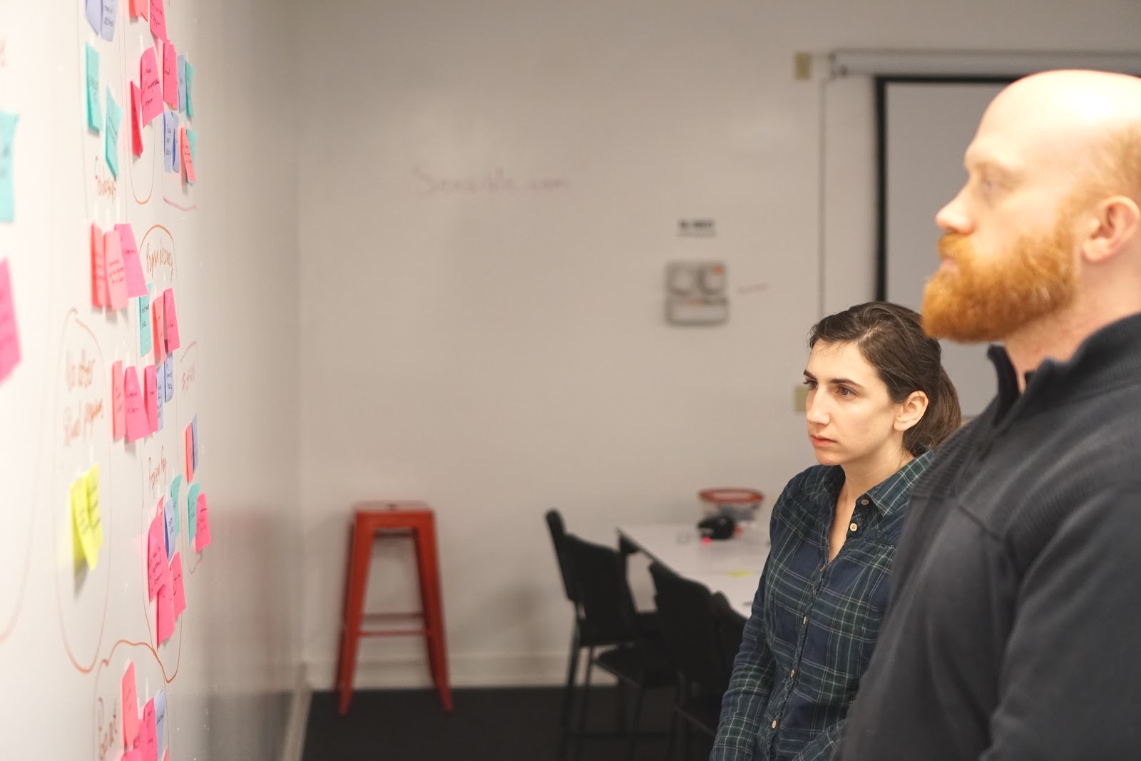
To begin our primary research, user researcher Brendan Thatcher conducted surveys and interviews with parents and after-school counselors. Interviewed parents indicated that a main concern they have is knowing where their child is after school is over. Interviewed after-school counselors indicated that most check in processes are via pen and paper sign in sheets. I assisted with affinity mapping, which led our team to the problem statement that after-school counselors need a way to notify parents when their children are checked into an after-school program because concerned parents need to know where their children are.
INITIAL SKETCHES
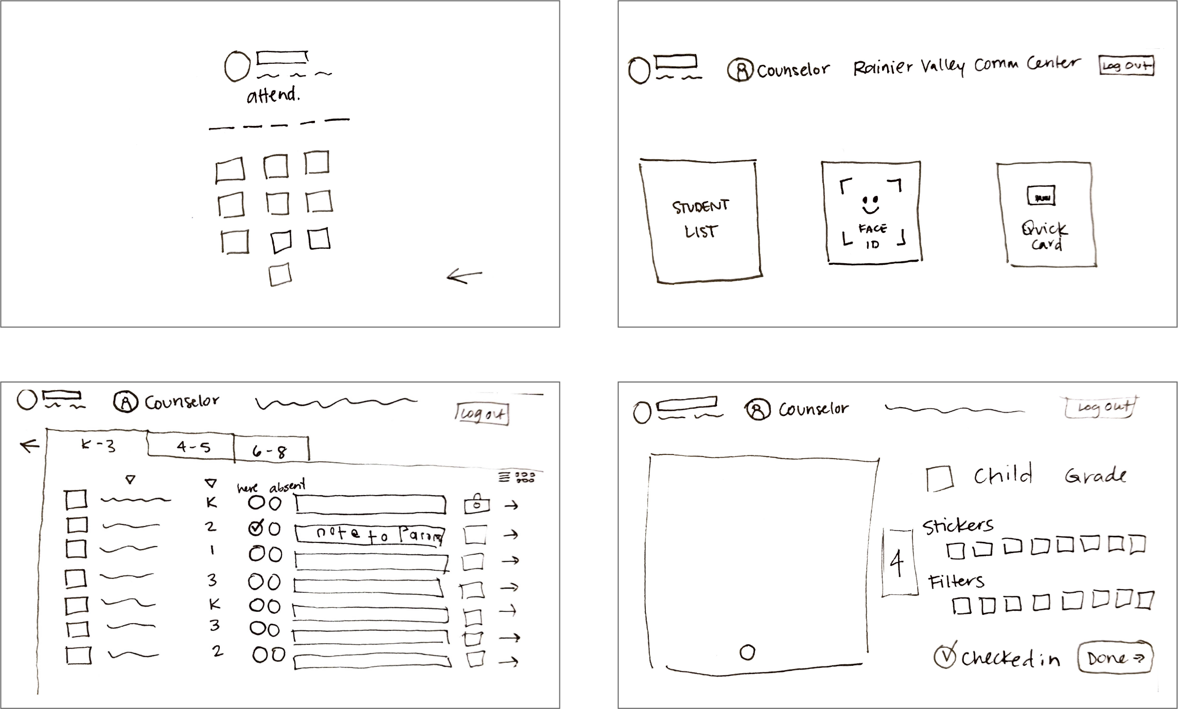
After the research and personas were provided to me, I started sketching some preliminary ideas on how a user (after-school counselor) would see a landing page and sign into the tablet app. I also included a page for a list of students, how the photo and sticker screen might look, and a confirmation screen. Once a child is checked into the community center, the parent will receive a notification.
USER FLOW
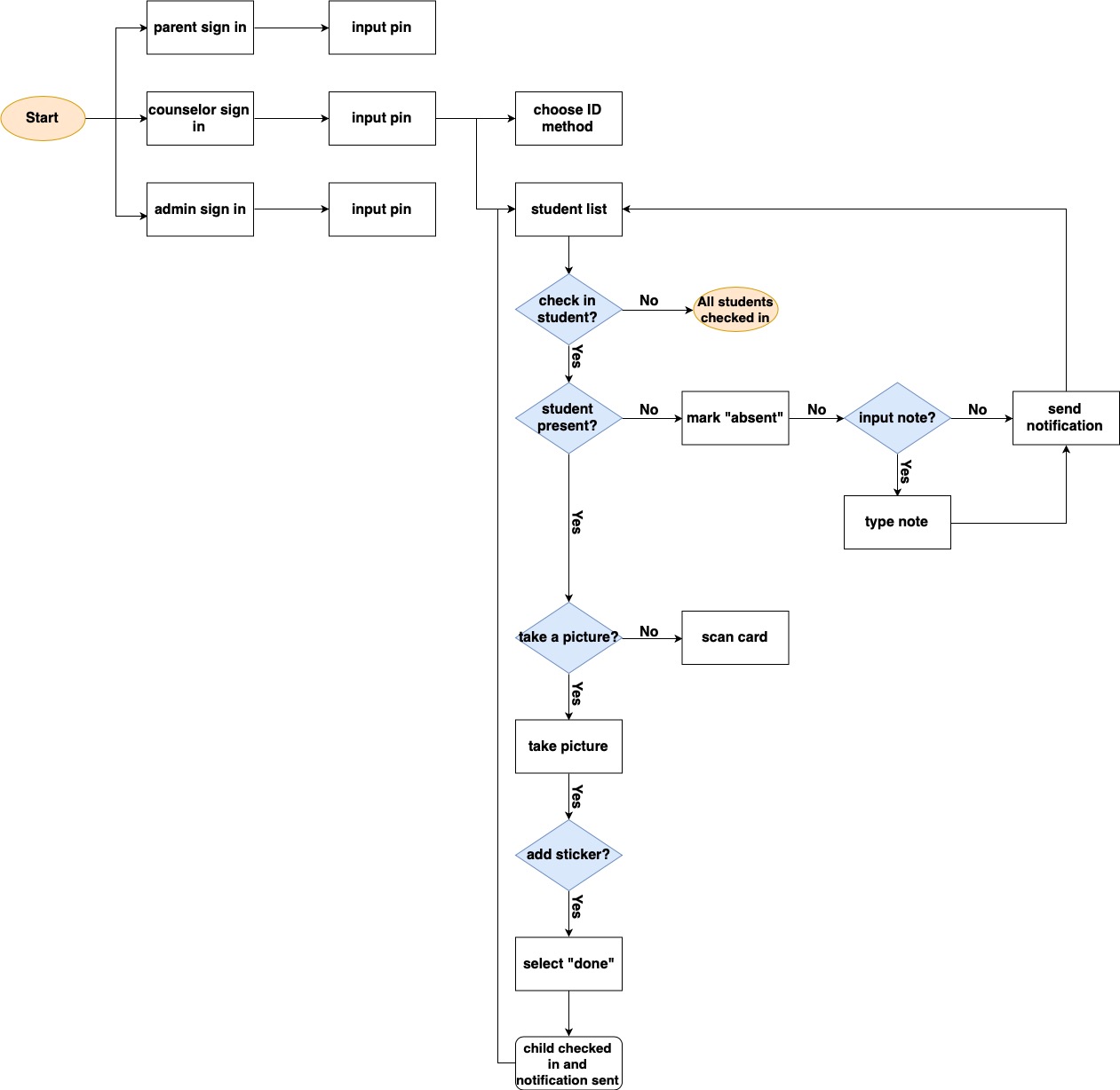
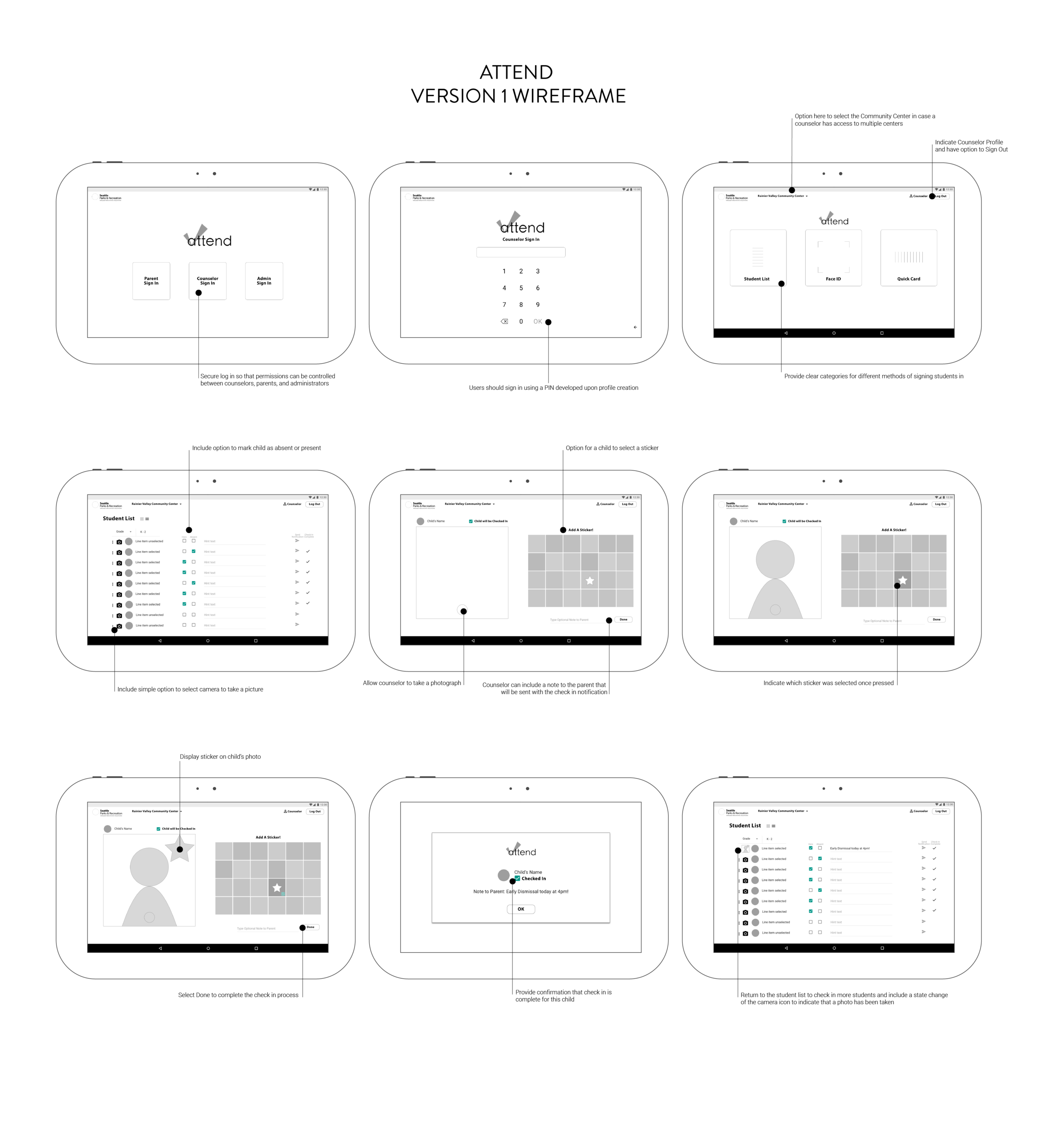
I worked with the project manager David Truong to solidify a user flow for the after-school counselor. The flow I wanted to focus on was the check in process, and I wanted to include the feature of taking a photo and adding a sticker to help engage and incentivize program attendance. Competitive analysis pointed to options to take photos, but none of the competitors were utilizing pictures during the check in process.
User Researcher Brendan Thatcher developed the usability tasks for the app and I began wireframing for the flow and tasks.
USABILITY FEEDBACK
Version 1
“There are too many checkmarks on the roster screen. There’s one if they are here, absent, and another to confirm the check-in. That is confusing.”
The camera feature and the sticker options are too small.
There is no keyboard to type a note to the parent.
To re-think the camera and sticker screen, our team conducted a design studio to gather more ideas.
USABILITY FEEDBACK
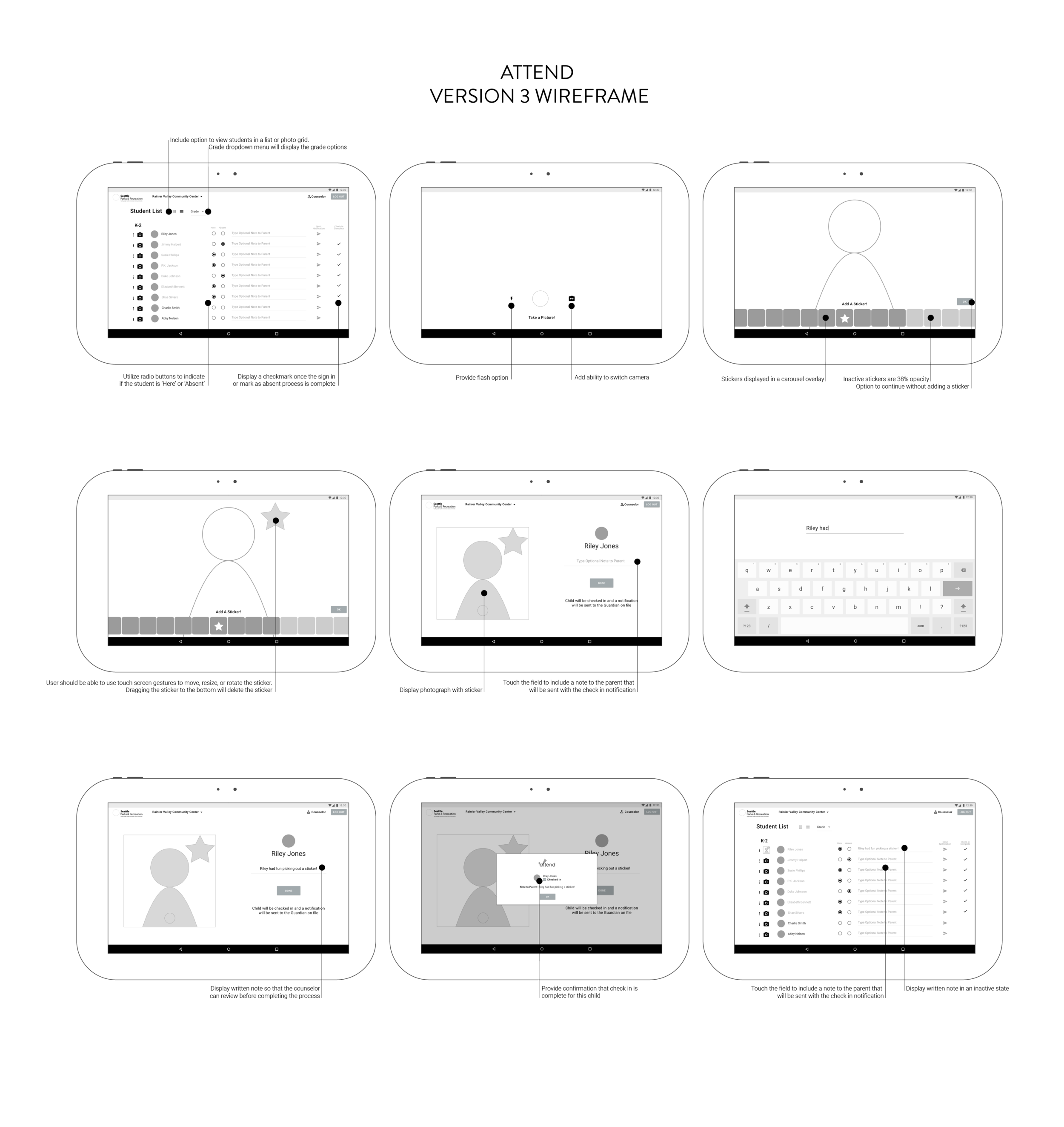
Version 2
“I can’t back out of writing a note if I need to.”
For the Version 3 iteration, I added the ability to close the keyboard when writing a note, and cleaned up the button styles to match Android designs.
USABILITY FEEDBACK
Version 3
User cannot cancel taking a picture.
“It's simple, easy to understand what it's purpose is, and clean!”
- J
“This is straightforward and I think the stickers are a nice touch. Having a five year old myself, I think it will be fun for kids!”
- JG
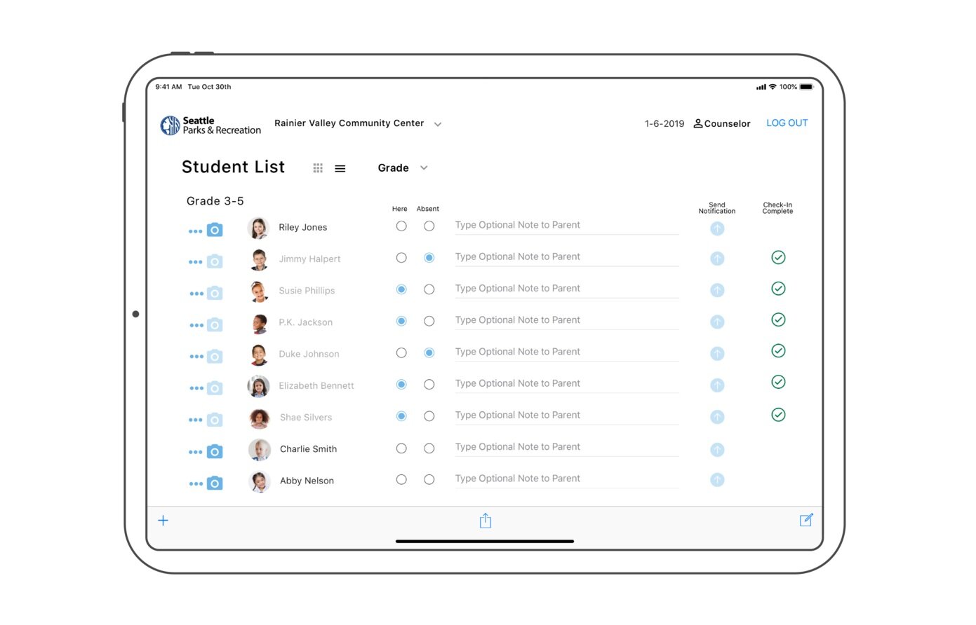
From this feedback, I added the ability to cancel taking a picture. I also added another state change on the camera icon on the student list screen to provide more visual clues around which students are already checked in.
Before beginning the mockup I developed the simple style guide below.

STYLE GUIDE NOTES:
1. Since this app is designed for Seattle Community Center use, I modeled my style guide after Seattle.gov. Schema Design created a font just for the City of Seattle. The font is called Seattle. It was not immediately available for download, so for the purpose of these mockups, I used a similar font - Myriad Pro - to create the Seattle logos shown in this mockup.
2. I opted to stay with the blue, white, and green palette from the Seattle.gov Style Guide to carry through the reliability of the brand and to emphasize trust. From my secondary research, I learned that trust is a concern among lower income families, and I wanted to use these colors to emphasize that the app and Community Centers can be trusted.
3. To continue this theme, along with promoting a great environment for children, I established a few guidelines on which kinds of stickers should be excluded: weapons, gory details, or inappropriate gestures. Required image attributions for some of the sticker vector images can be located here.

MOCKUP
The task flow here is a counselor selecting the student list to choose a student, completing the check in process by taking a photo and allowing the student to choose stickers, and sending a note to the child’s parent/guardian. The last screen is a mockup of a push notification that the parent would receive.
PITCH VIDEO FOR ATTEND:

NEXT STEPS:
To continue with this project, I would work on additional items from the MVdP:
Wireframes, designs, and testing for the iOS App
Admin sign-in and functionality
Student Attendance Reports
User flow and screen for Parents signing children out of program at the end of the day
Proactive messaging for the Counselor
Conducting more research with the community center directly would be crucial to understand limitations and desires
I would definitely want to test this with a small group of students to get their reactions/insight. Children are honest!


